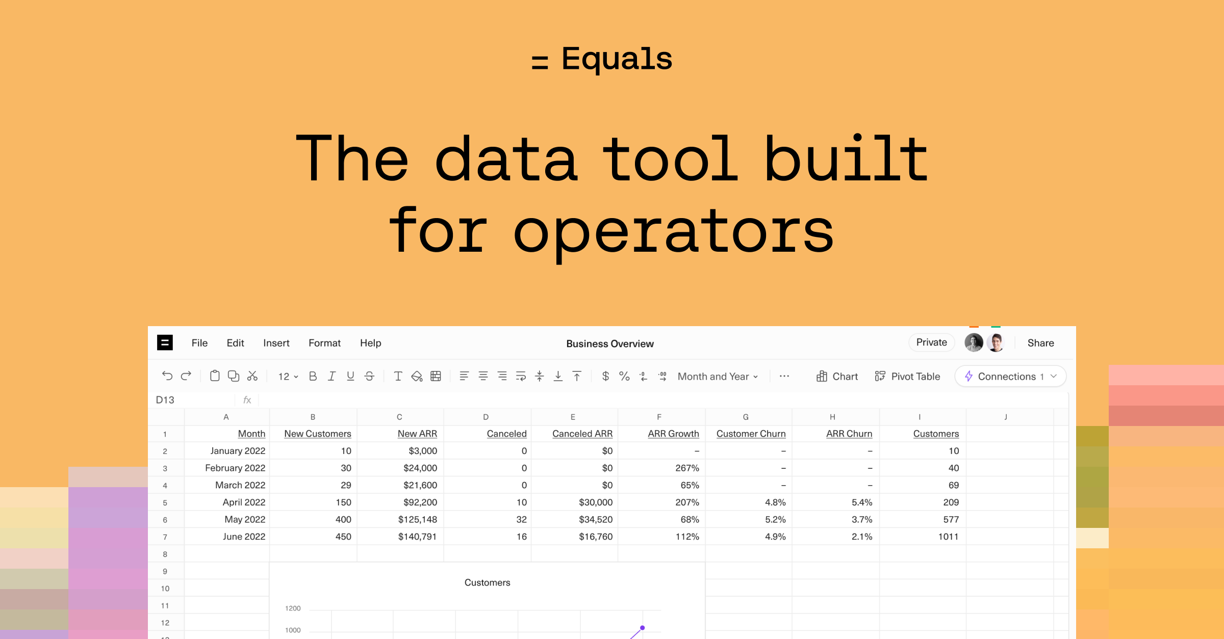
9 mistakes we made with our new homepage
Bobby Pinero | | 4 min read

After launching our brand new homepage last week we sat down with our friend Matt Hodges. Matt has a decade of experience leading marketing at companies like Atlassian, Intercom, and Loom. He’s one of the best b2b product marketers out there.
We were pretty proud of what we’d shipped. Matt tore it apart. We cut up our hour long conversation into the 9 key mistakes we made. Let’s dive in.
1. Headlines are hard. They should evoke emotion and make you read more.
The most impactful first impression on your site is your headline. You have to get it right. Site visitors should have a clear reason to want to read more. Avoid vague statements without any punch. Focus on sparking a reaction that motivates people to invest more time to learn how your product can make their lives better.
2. Videos are powerful. But, most people won’t watch (all of) them.
It isn’t a bad thing to have a video demo on your site. It is a great way to show what your product can do without requiring people to sign up for a demo. However, most people will not click on the video. Even if they do, most people will not watch the whole thing. So, don’t rely solely on a video to showcase your product. Make sure you are showing it off throughout your page.
3. Start with the magic. Then show the trick.
One of the best storytelling devices is to start with the end and then take your audience on a journey showing them how that ending came to be. This is a brilliant way to showcase your product demo as well. Start with the outcome, the benefit, the way your product makes your customer’s life better first. Then, guide them on a journey that shows how they can get there using your solution.
4. Tell people why they should care (like you would tell your friends).
Take a second and explain what your company does to a friend (like I did here with Matt). You’ll probably explain it in simple terms and you’ll also have some feeling behind it. For some reason, as soon as we get to explaining it on a website we remove simple storytelling and feeling and replace it with jargon and complexity. Tell an easily understood and persuasive story to your buyers.
5. It’s called the hero for a reason.
Heroes save the day. They are focal points. They perform mind-blowing acts that are the stuff of legends. The first section of your site is called the hero for the same reason. Make the most of this valuable real estate. It’s the one thing you’re guaranteed everyone will see when they visit your website. The entire section, down to the last pixel, should move people to want to learn more. It should also quickly communicate both verbally and visually why people should care about your product. It is best practice to lead with the product, create an amazing headline, and quickly communicate your value-prop. Make sure you also think about the way you are visually communicating why you are awesome.
6. Don’t bury the lede.
Sometimes the value props of your product take some time and space to thoroughly explain. When that is the case, it is easy to fall into the trap of making entire sections for your top value props and never thinking twice about how they should also be incorporated above the fold in the hero section. Think of short and simple value prop statements for the top benefits of your product and get them above the fold.
7. Show me the product!!
When you are presenting abstract ideas around intangible products like software and services how should you visually communicate those? More and more software buyers just want to see the product. This has been a problem for web designers building websites for software companies for years. A gag reflex reaction from designers to stock photography has led to a trend of using abstract illustrations to communicate what software can do for customers. However, more and more buyers just want to see the product in action. There is no reason to use abstract illustrations if you can communicate the message by just showing the product.
8. People are lazy. Avoid walls of text.
You want to make sure your customer testimonials don’t look like you copy and pasted a stock photo into your website. Pick out the most interesting piece of the quote and highlight it. Don’t make it too long (nobody is going to read a paragraph long customer quote). Then think through the best way to make your customer look awesome and to quickly showcase to your audience that (1) the customer knows what they are talking about and (2) they love your product.
9. Less can be so much more.
The FOMO effect is real. Many websites use it to make you feel crazy for not checking out their product. Companies do this with overwhelming logo walls as well as with quote upon quote in a never-ending quote wall. This isn’t a bad strategy, but be a little more thoughtful around it. Instead of just a massive page of quotes highlight a few of them first, then you can put the rest below the highlighted section. Also, make sure you are highlighting important items in the quotes. If you have amazing people as customers from aspirational companies, or with phenomenal job titles don’t bury that information so nobody will ever see it.
This teardown session with Matt was incredibly helpful for us. I walked away with clear next steps on ways to improve our site. We can also easily track and report on how these changes are helping our website goals using the Top of Funnel Template in Equals.

By Bobby Pinero
CEO and Co-Founder of Equals.

