The never-ending quest to create the perfect homepage
Matt Hodges | | 7 min read
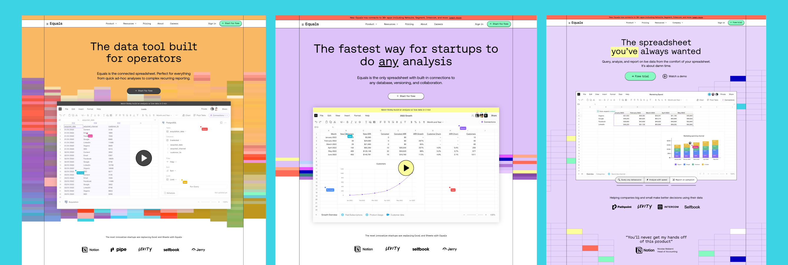
After tearing down their homepage, I joined Equals. Now it's time to put my money where my mouth is.
A little bit of context
The homepage is the digital front door to any web-based business. Almost everyone who considers buying a product or service will land on it. And, like most things in marketing, you don't get a second chance to make a first impression. Ideally, you want everyone with intent to ring your bell. But there's no such thing as "the perfect homepage". That doesn't mean you shouldn't try, though.
A project (almost) 10 years in the making
"Redesigning the homepage" was the very first project I took on when I joined Intercom in 2014.

And then at Loom in 2019.

In both cases, we redesigned the homepage again. And again.
I made the homepage my first project when I joined Equals because I knew firsthand how impactful it could be. The team had recently shipped a new one, which didn't perform well, and the product had also evolved a lot.
The goal
Create a new homepage that conveys the unique value of Equals and improves conversion. Easy. 😅
Perhaps a more straightforward way to think about it was creating a homepage that helped bring our mission to life.
Before I continue, I have to say a huge thank you to Stewart and Judson from the Design Business Company. Our new homepage is as much theirs as it is ours. 🙏🏻
Grab your "building blocks"
With more than a handful of homepage projects now under my belt, I've developed a standard set of building blocks in my attempt to construct the perfect homepage. They're kind of like the ingredients of a movie. And if you've read my post on Inside Intercom – 12 steps to creating landing pages that convert - some of these might sound familiar:
- The Hero
- The Trailer
- The Leading Roles
- The Reviews
- The CTA
1. The Hero: You have 8 seconds to capture people's attention
According to Microsoft we now have shorter attention spans than goldfish. 🙃
Also known as "above the fold", the hero is, without a doubt the most important real-estate on your entire website. Not only does it need to quickly and clearly communicate what you're selling, but it must also convey why people should care.
For us, every visitor needed to understand that Equals was, first and foremost, a spreadsheet. We're not a "new take". We're not trying to reinvent the wheel like many others. We're simply building a much better one. One that's built for today (not last century).
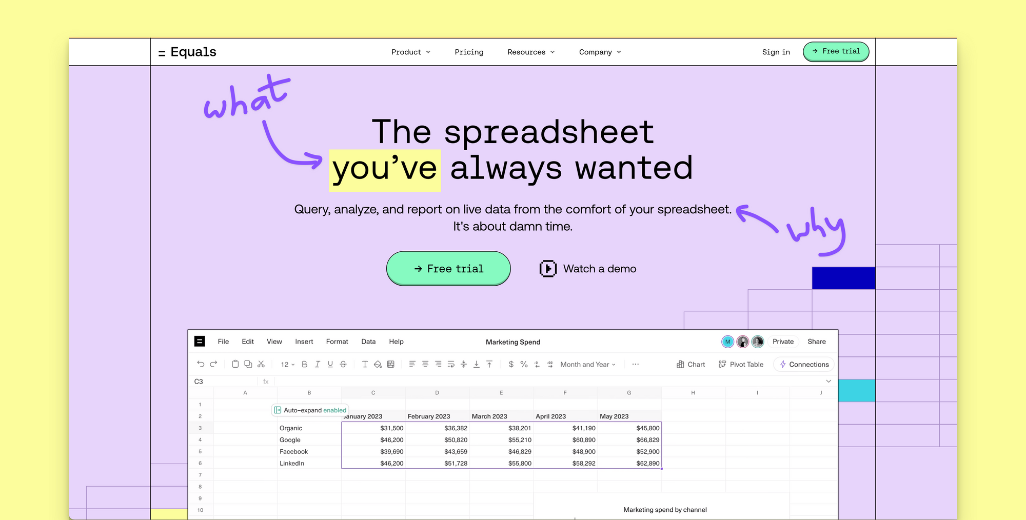
The jury's out on whether you should lead with the what or the why. We chose the what because we feel people must understand Equals is a spreadsheet. If they're unhappy with their current one, they'll hopefully be intrigued enough to learn more.
A quick note on uncovering the what and why
This is the first time in my career I've been tasked with taking a product to market for which I'm not the target persona. And here's the thing: If you don't understand a product, you'll do a terrible job marketing it.
So, one of the first things I did when I joined Equals was interview our co-founders - Bobby and Ben - and our biggest power user, Chris (who also happens to run Finance and Analytics). I asked them each a set of simple questions and used Notion AI to pull out the key points and summarize their responses for me.
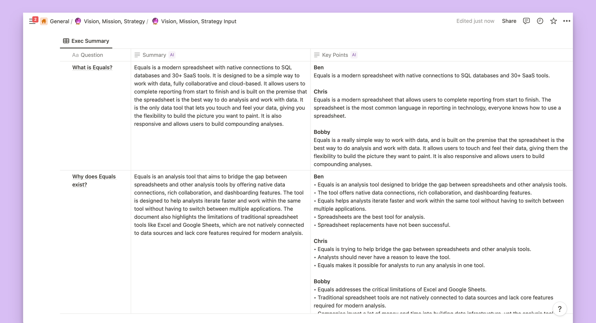
This is actually the approach I took to helping Ben and Bobby articulate Equals' Vision, Mission, & Strategy. It just happened to give me a huge leg up when it came time to put pen to paper on the new homepage. Two birds, one stone, they say.
2. The Trailer: Make them want more
Every movie has a trailer. You know, the clip that auto-plays when you're spending 30 mins figuring out what to watch on Netflix? That one.
According to ChatGPT...a trailer is "a short promotional video that provides a glimpse of a film and aims to generate interest and excitement among viewers...Trailers are used as marketing tools to create anticipation and persuade audiences to watch the movie when it is released." Spot on.
We offer two flavors on our new homepage:
- A real demo of Equals in 2 minutes by Bobby. Yes, it's real. No tricks here.
- Three quick videos that auto-play on scroll, covering the core jobs to be done.
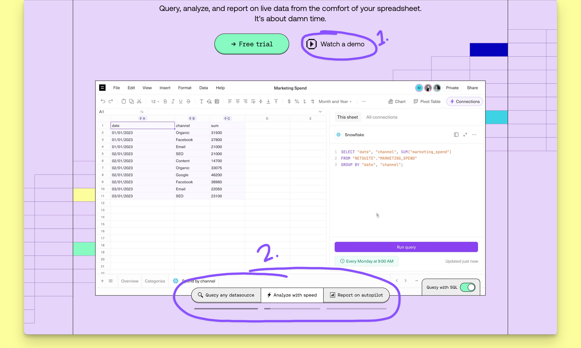
Why two? In my experience, only ~30% of people will "click" to watch your video. I'm not great at math, but that's the minority. Like any good menu, people love options, but there are some that prefer you order on their behalf.
P.S. We explored several different approaches for number two. Here's a little peek behind the curtain.
3. The Leading Roles: Bring your claims to life
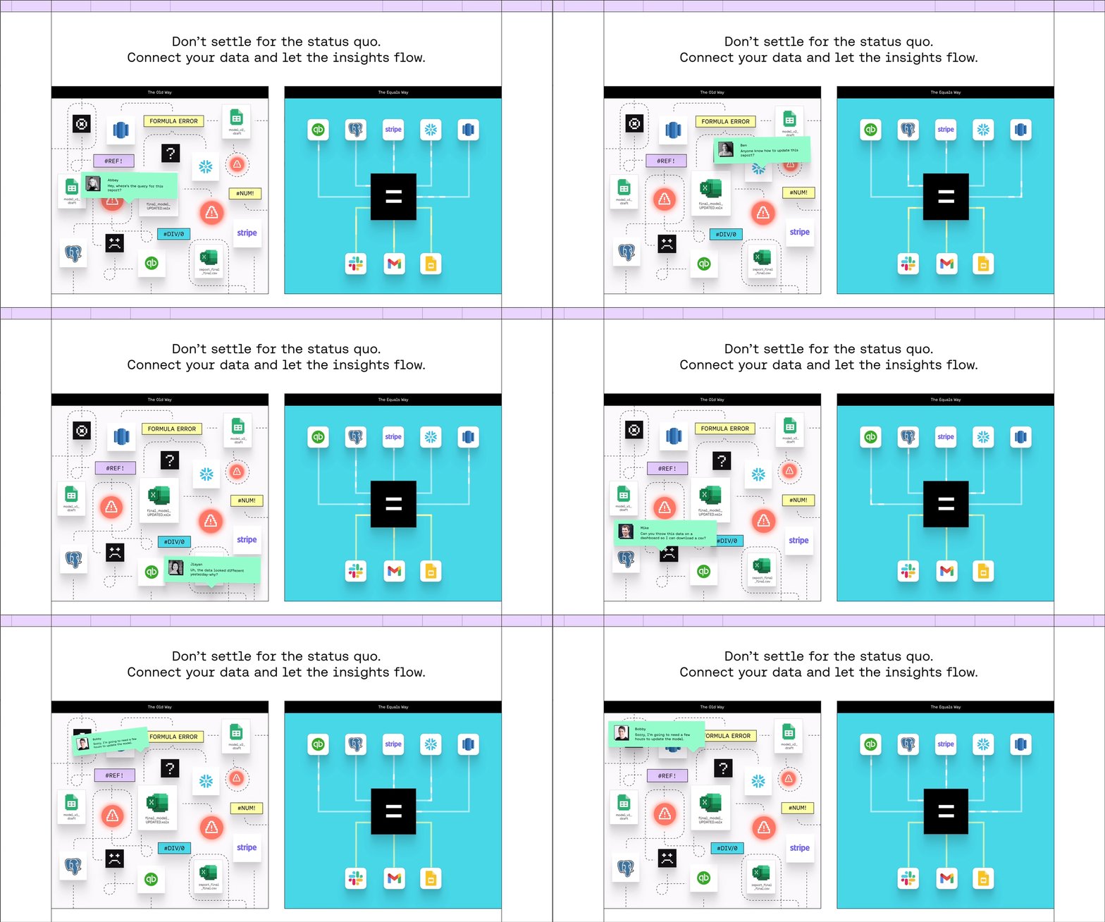
You've made some bold claims by this point. Now you've got to back them up. We start by setting the scene and helping people answer, "How does Equals fit into my existing world?". Enter the Intercom classic, The Old Way | The New Way, but Equals-style.
Next comes showing how Equals enables you to "query, analyze, and report on live data from the comfort of your spreadsheet" while making it clear what problems it's solving along the way.
As an amateur spreadsheet user, I knew what features made Equals a superior solution; I just needed help articulating why they were so valuable. So, I consulted our power users.
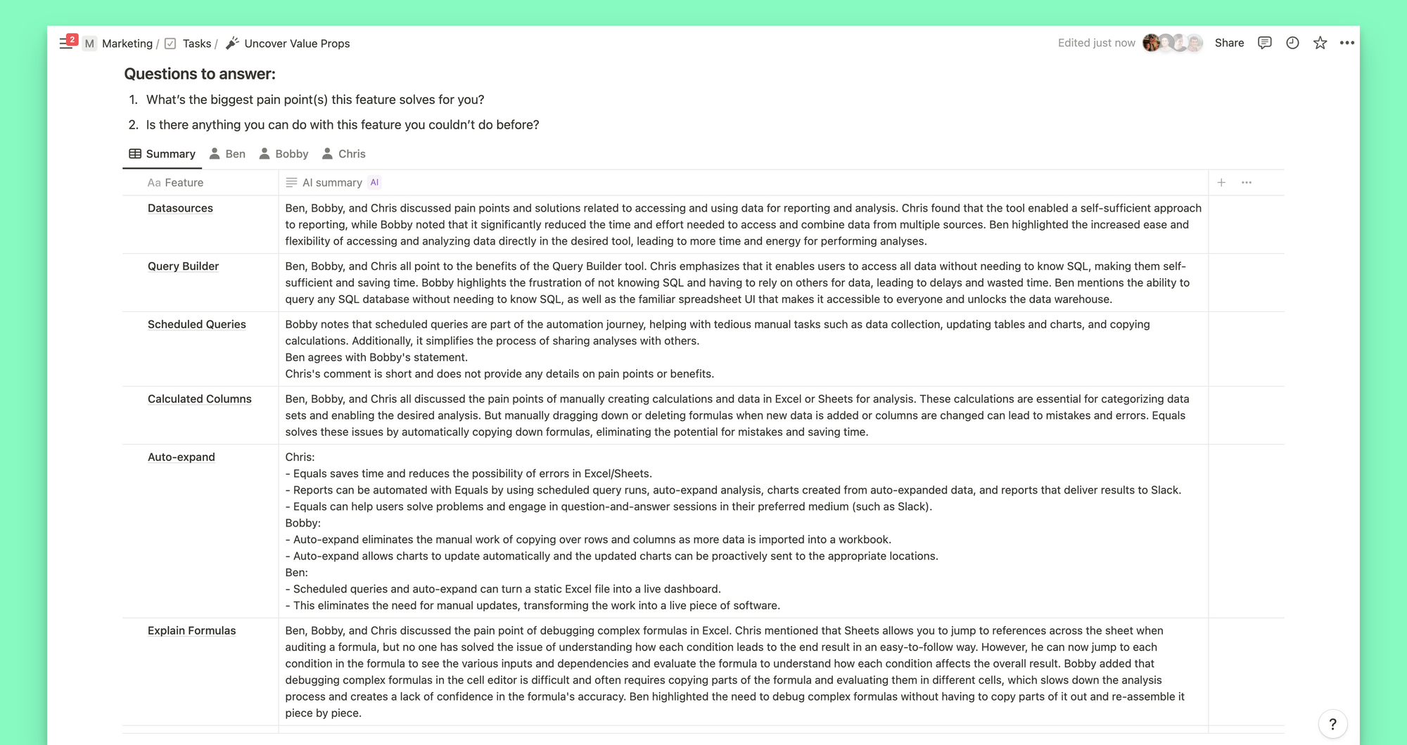
From here, and from the Vision, Mission, & Strategy interviews, I identified four distinct benefits of Equals. Together, these benefits show how Equals is "the spreadsheet for modern data analysis" while addressing some known FUDs (Fear, Uncertainty, and Doubt).
- Directly connected
No more downloading CSVs or copying and pasting queries. - Intelligently automated
Equals excels at rote tasks, so you don't have to. - Finally foolproof
Your team can always act with confidence, speed, and clarity. - Seriously secure
You can rest assured that your data is safe with us.
Each benefit has its own section that highlights three supporting features or characteristics of Equals, focusing on articulating the problem each solves.
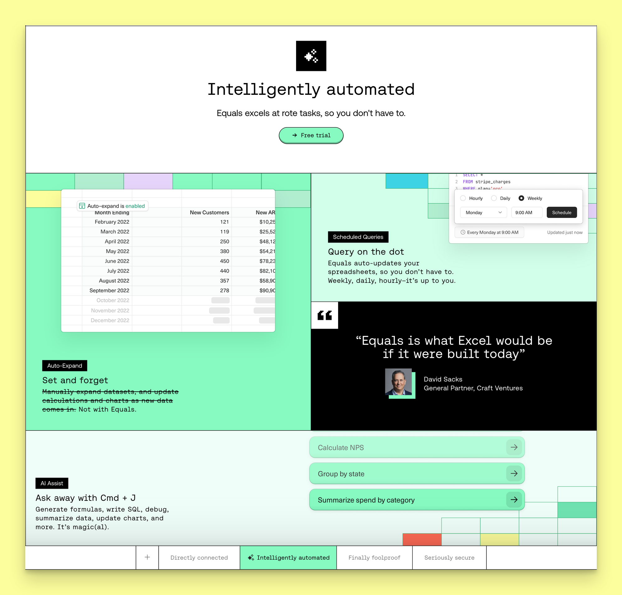
Lastly, given this is a BIG "block", we wanted people to understand where they were in the "story". That's why a spreadsheet-esque navigation bar appears and sticks to the bottom of your browser as you scroll through this section.

4. The Reviews: AKA the social proof
As an early-stage startup with a product that handles data, we need to establish credibility early in the buyer journey to have any chance of converting further down the funnel.
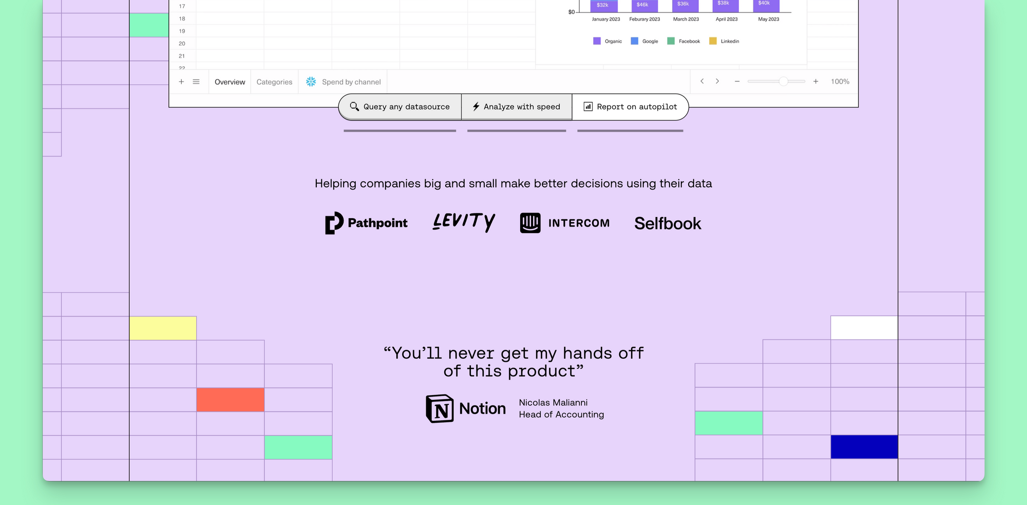
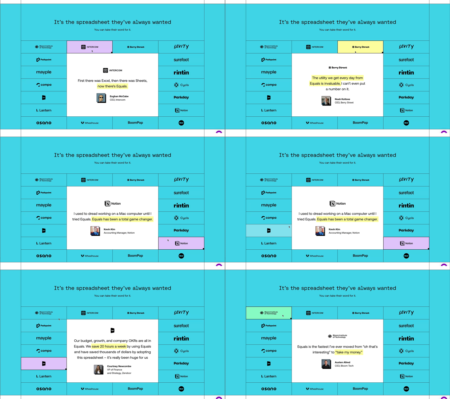
Displaying the logos of notable or lookalike companies that use your product is a tried and tested method, as is showcasing testimonials from your most passionate users. Ideally, they represent your target personas and are a known entity amongst the people you're building for.
We do both below The Hero before you're introduced to the The Leading Roles.
For those who want or need more, we showcase another 18 testimonials towards the bottom of the page (just in case).
5. The CTA: Get people to take action
What's the point of getting people to your front door if you don't make it easy for them to ring the bell? None.
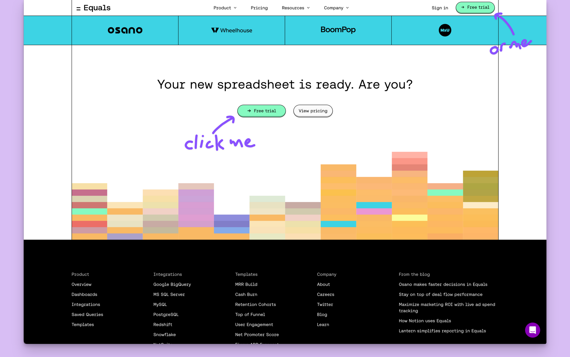
Our homepage's primary goal is to get people with intent to use the product to start a free trial. That's why you'll count seven green → Free trial buttons throughout the page, including one that persists in the site's primary navigation as you scroll.
Why green? Green = go!
One final tip: Read all the headlines (together)
I hate when someone asks me, "What books do you recommend?". I'm not a reader. I scan. And I'd wager that's what most people coming to your website are doing, too. That doesn't mean you shouldn't sweat the details of every line and word of copy. I do. But don't be surprised if very few people read them all.
At best, you can expect people to read your headlines. That's why I think it's important to read all your headlines one after the other. It's a simple exercise that helps you step into the shoes of a visitor and ensure that your homepage "flows".
Try it:
- The spreadsheet you've always wanted
- Don't settle for the status quo
- Connect your data and let the insights flow
- Directly connected
- Intelligently automated
- Finally foolproof
- Seriously secure
- Ready to plug 'n' play
- It's the spreadsheet they've always wanted
- Your new spreadsheet is ready. Are you?

By Matt Hodges
Early leader at Atlassian, Intercom, and Loom. Now at Equals.

