Everything we measure at Equals
Chris Burgner | | 9 min read
It's hard to get your metrics right. It's more challenging when you're starting from scratch. I learned the hard way. I'm writing this so you don't have to.
One year in
Joining Equals as the 12th employee, it's taken a year of constant iteration to get to a set of key metrics (that we all watch like hawks). They cover everything from how someone discovers Equals at the “Top-of-Funnel” (TOFU) through to the point of paid conversion, and finally, how they engage and retain over time. Oh, and they also cover our operating model, which dictates hiring and runway. No biggies. 😅
“What gets measured gets managed.”
It's true. You can only hold yourself and your team accountable for the things that you measure. And in our experience, it’s not enough to just have the metrics. They need to be disseminated across your company as quickly and as frequently as possible. That’s the way to create a culture of speed and accountability in your startup. Fortunately, unlike traditional spreadsheets, Equals has Dashboards, to ensure every analyst can get their metrics in front of their stakeholders–how they want it, where they want it, and when they want it.
Now for the metrics
In the spirit of building in public, we're sharing all the metrics we believe an early SaaS business needs to run–soup to nuts.

☝️ A quick disclaimer
You're about to see actual reports we use to measure our business. They're just filled with dummy data for obvious reasons.
It all comes down to engagement
We'll get to TOFU, but first, we all know that highly engaged users lead to loyal, valuable customers. That’s why we closely track a handful of engagement metrics.
A3x7
Our most crucial engagement metric, A3x7, stands for “Active 3 out of 7”. This tells us how many users were active in Equals on at least three or more days in the week. It's a more common approach to measuring engagement in B2C. Most popularly, Facebook would measure 5/7 as a way to understand deeply engaged users. For us, we look at 3/7 because it tells us if a user is active in Equals for the majority of the work week.
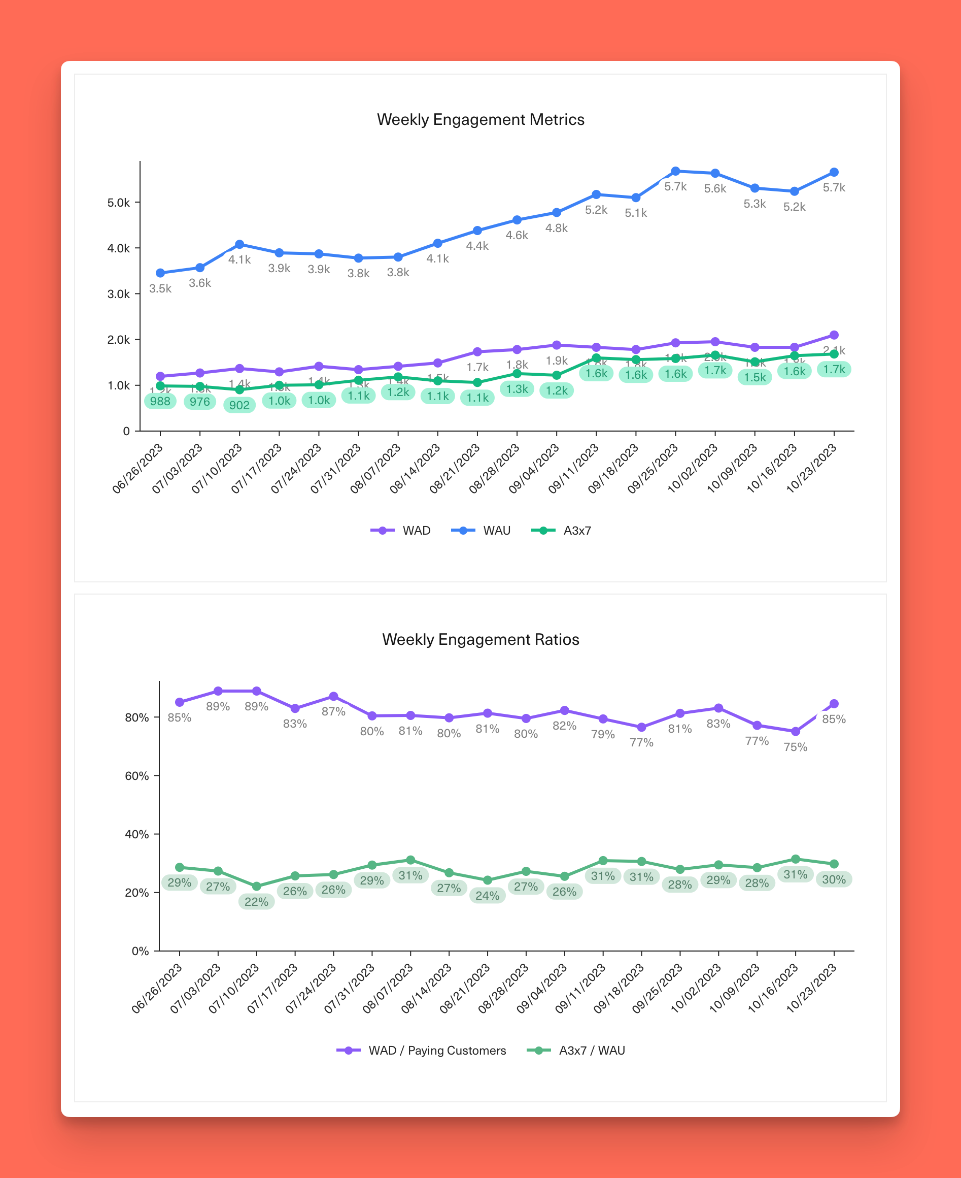
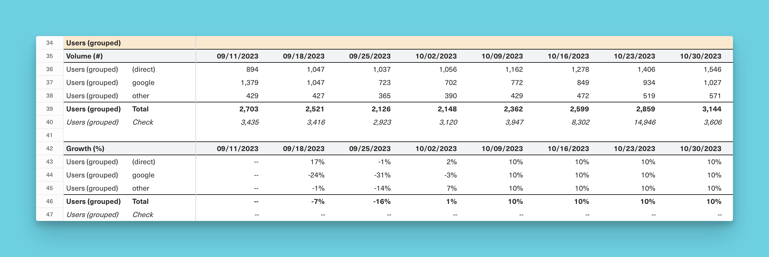
The WADs and the WAUs
We also keep a close eye on standard metrics like Active Companies, which we call Weekly Active Domains (WADs), and also Weekly Active Users (WAUs).
We have a few criteria that must be met to be counted as “active":
✅ User/domain aged ≥ 7 days
First, the user or domain must have aged at least seven days. This helps cut out noise from signups that abandon after a few days.
✅ Logged a non-scheduled event
Second, you have to have logged a non-scheduled event. This is somewhat unique to Equals because you can schedule query runs and data updates, we want to avoid inflating the numbers with actions that happened on autopilot and only focus on those where a human was engaged in the product.
In addition to tracking how the volume of these metrics trends on a nominal basis, we also view them across a couple of different dimensions:
1️⃣ WAD / Paying Domains (Customers)
Just because a customer is paying you money doesn’t guarantee they’re active in your product. Seeing this trend higher (upsell opportunity) or lower (churn risk) can tell you a lot about the health of your customer base.
2️⃣ A3x7 / WAU
Of your active users, how many of them are heavily engaged? Benchmarks for this can vary based on the size of your user base, but seeing something above ~30% is solid and >50% is really impressive.
TOFU-time (the inedible kind)
Growth is critical for any startup. And it all starts with how you create and convert demand. AKA your “Top-of-Funnel”.
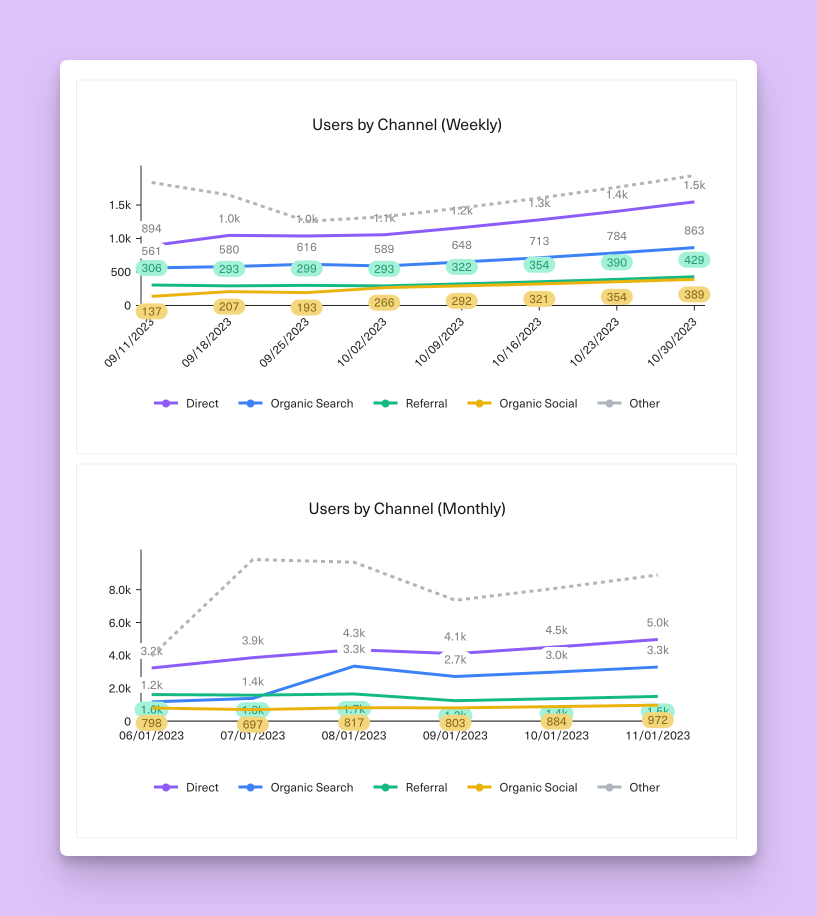
Marketing Site Visits by Channel
We keep a particularly close eye on direct traffic, organic social, and organic search - as those are currently our biggest drivers and the areas we're actively investing in. They're also the best sources of efficient, sustainable traffic. If you're able to grow and have these channels continue to make up the majority of your traffic, you're in a good place. Using the Google Analytics (GA) Connector, we're able to pipe all our website traffic data into and slice, dice and chart it however we like.
Wait, no Paid Search?
That's right. We recently turned off all paid search. And trials went up. Go figure.
Deconstructing the funnel
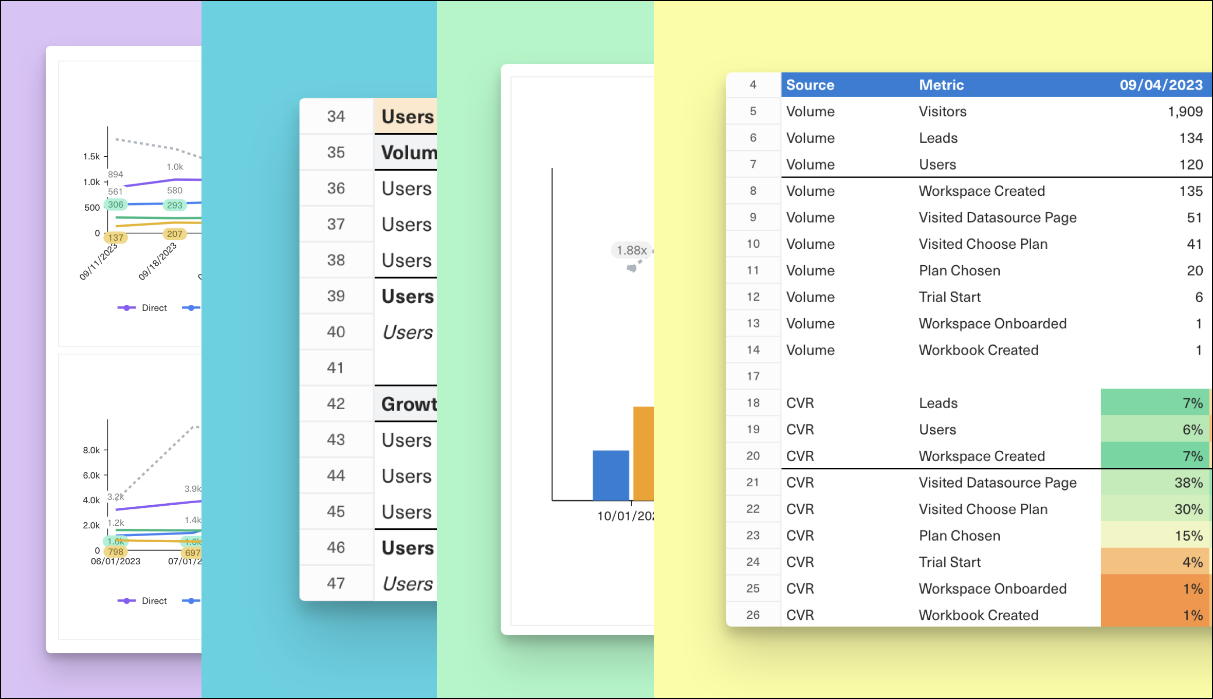
We've set up instrumentation to match GA cookies to signups (users). This allows us to break down our entire funnel by channel. This is a critical step that most companies miss or never invest in doing. Trust us. Just do it.
We break our funnel down into nine stages that mirror the steps in our onboarding flow. This is something that's unique to every company, but the structure of the reporting and how you think about it is universal. We bucket our TOFU performance at weekly and monthly views, cohorted by Workspace creation. This gives us a clear(er) picture of how changes we make influence conversion rates.
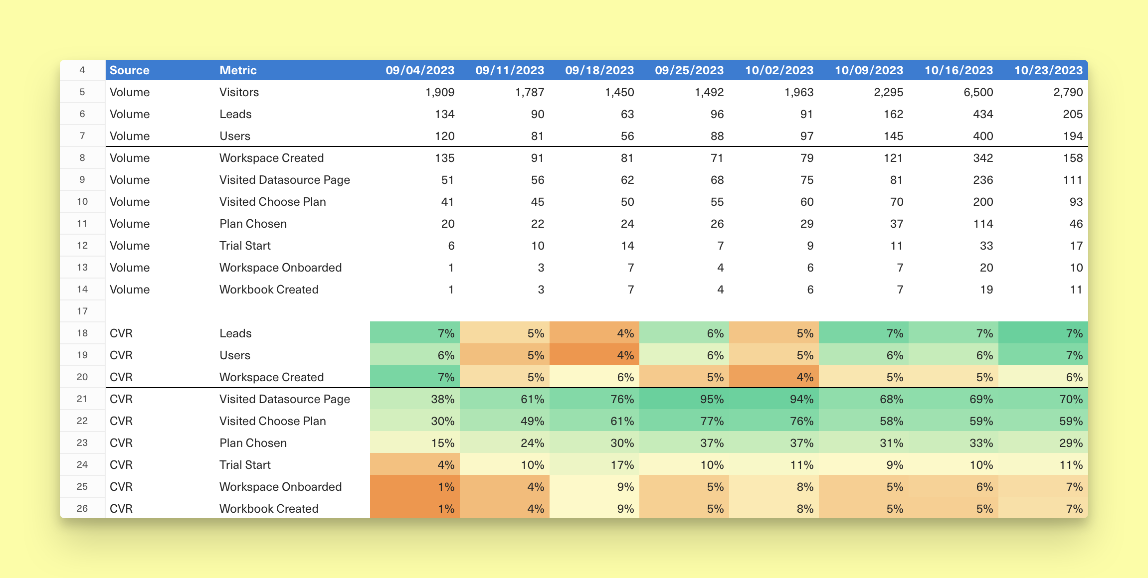
Where should you start?
Start by documenting each step in your onboarding flow–from website visitor to completed signup. As you do this, keep two goals in mind:
1️⃣ Define every stage
Document definitions so stakeholders know exactly what they're looking at.
2️⃣ Connect the dots
Enable underlying event tracking so you can easily link one stage to another.
Now for the money (aka ARR)
As you start to piece together how your funnel converts, the next step is to look to understand how Annual Recurring Revenue (ARR) comes to be. Here's the very simple equation to calculate it.
ARR =
Starting ARR balance
⊕ ARR from each new customer
⊕ ARR from expanded customers in that period
⊖ ARR from contracted customers in that period
⊖ ARR from churned customers
Expansion is defined as a net increase, while Contraction is a net decrease in spending from an existing customer. Churn is also a net decrease but is accompanied by a customer cancelling all active subscriptions of your product (i.e. the point at which they’re no longer a customer).
Our own ARR Build
We track our ARR religiously at Equals. We like to see how many customers convert from our funnel, which generates Gross New ARR. We measure Annual Contract Values (ACVs) for new customers, which help us understand the dynamics of new traffic sources, pricing changes, and any other onboarding experiments. And then, we look to expansion, contraction, and churn as good ways to understand the health of our existing customer base.
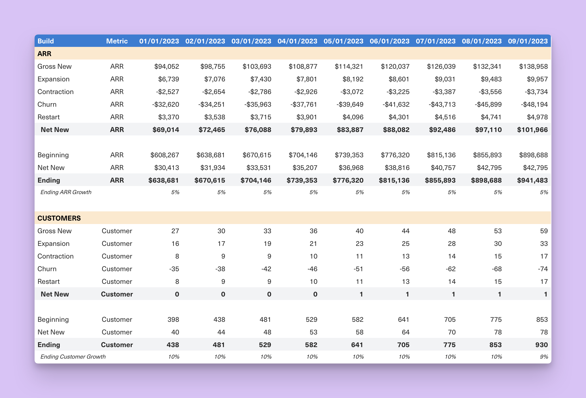
There's a lot that went into creating our ARR build, but the TL;DR is we create a flat file that shows the company’s ARR, as well as the component parts (e.g. new, expansion, contraction, churn) that contribute to movements in ARR on any given day. From here, calculating ARR requires a strong understanding of the company’s product catalog and how customer subscriptions are provisioned. Because we handle all invoicing in Stripe, all of the SQL we wrote is based on Stripe tables.
For a detailed list of considerations and how to build a source of truth on ARR, check out our earlier post. And if you want to dive into Equals and build your own, there's an Equals template to help you get started. It includes the underlying queries that powered our own V1 ARR build.
Don't forget your sales pipeline
About half of our growth comes from our self-serve business and the other half through sales. So it’s become really critical for us to track and measure the performance of the Sales team.
Understanding the high-level inputs is critical in driving the outputs you want to achieve. For activity, we seek to understand a few key things: how many inbound leads we are generating and how those convert to meetings, opportunities and pipeline.
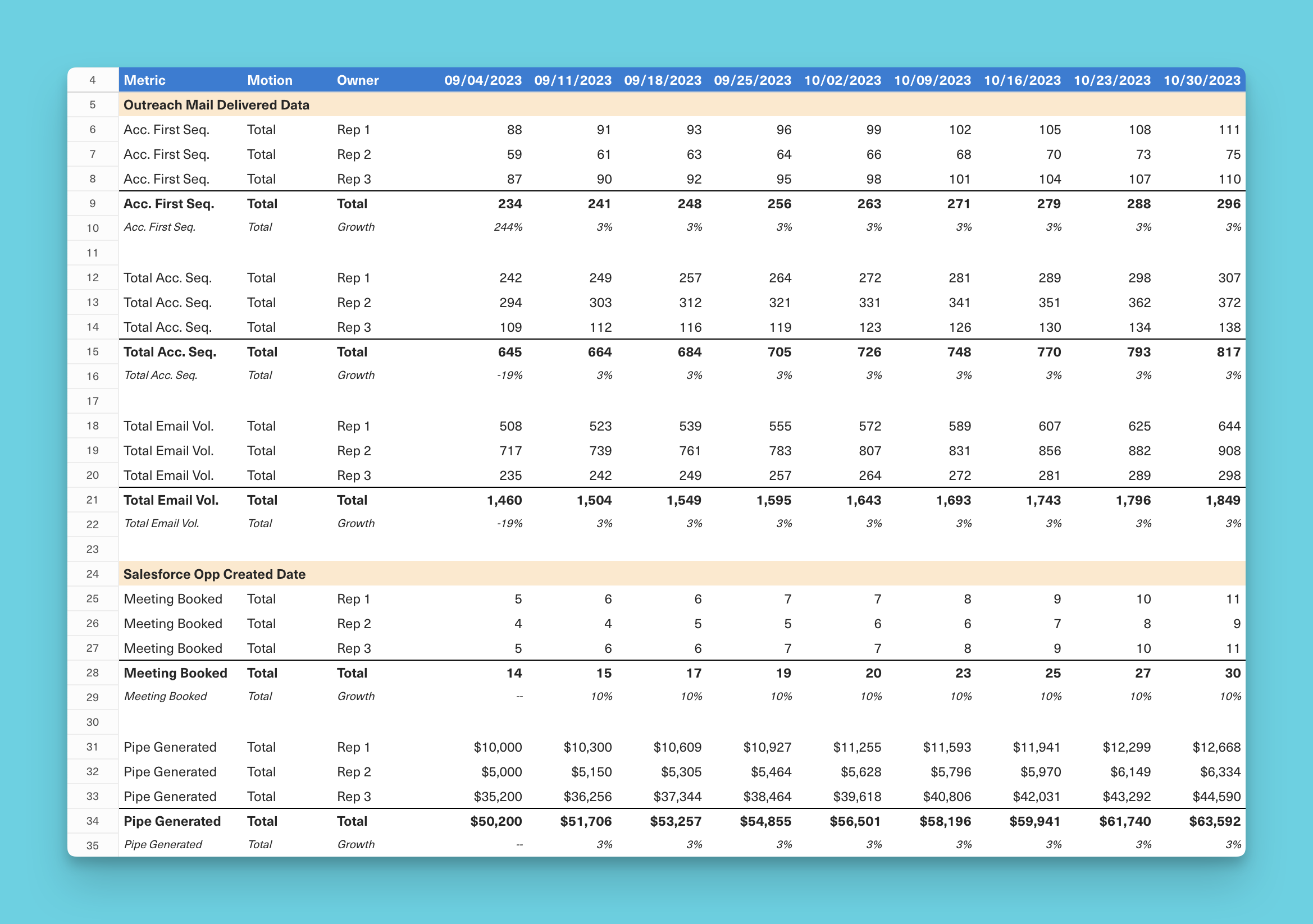
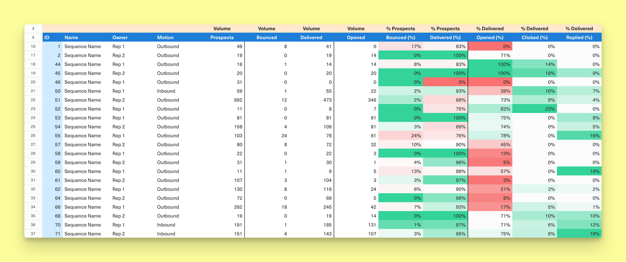
Prospecting activity
Below is an example of how we track prospecting activity for emails. This captures activity at the rep level, and we have views that break this down between Inbound and Outbound motions.
Prospecting performance
Just as important as seeing how much activity is taking place is measuring the effectiveness of prospecting. To get a sense of this, we’ve connected Outreach into Equals so we can build customer reports at the email campaign (or sequence) level to understand delivery, open, click, and reply rates. Tracking at this level of granularity allows us to see what messaging is landing with prospects and tweak our outreach strategy on the fly.
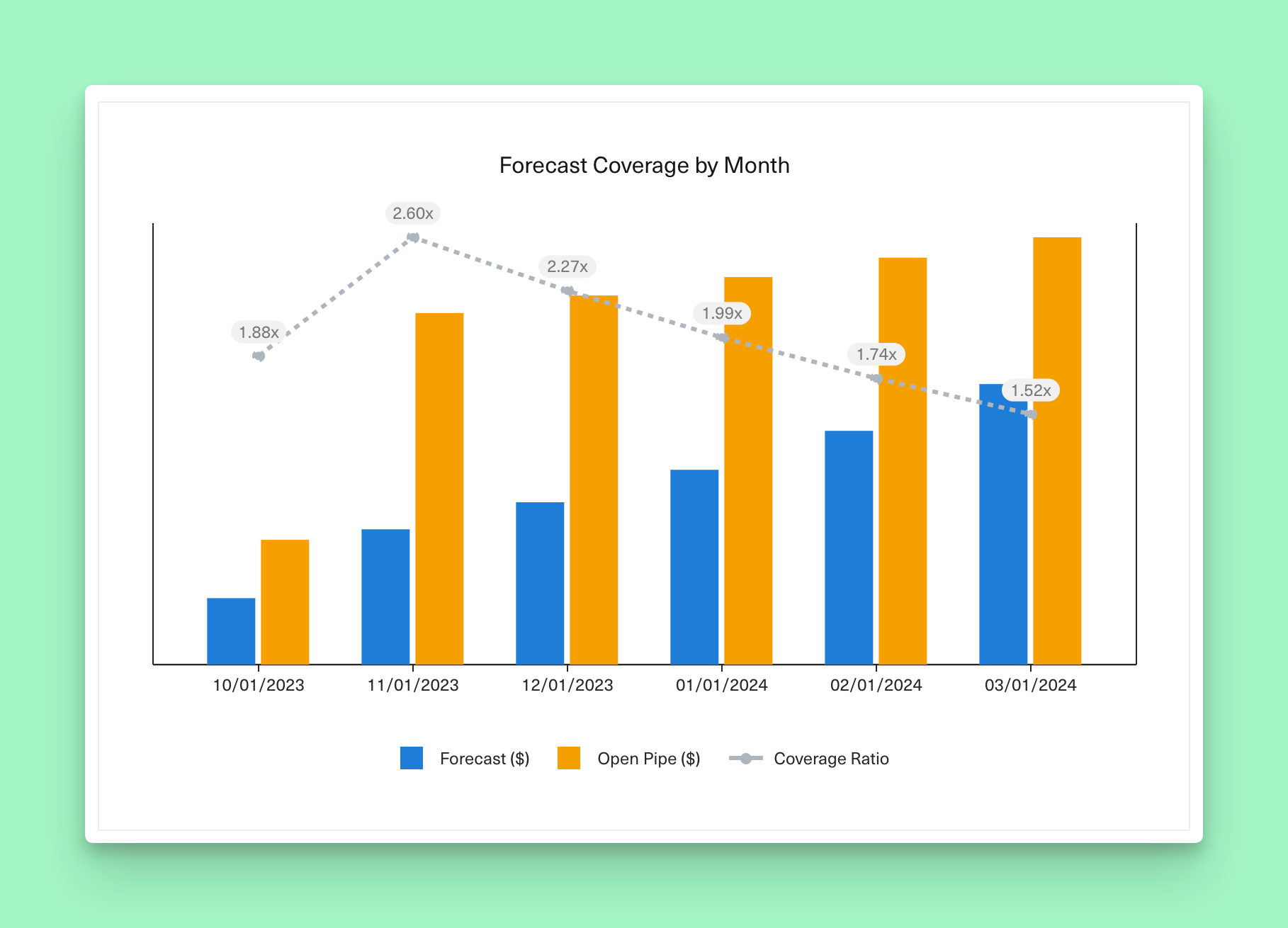
Pipeline coverage
From here, we do more traditional mid and down-funnel sales reporting. We look at how much pipeline is open and set to close in any given month to understand coverage ratios.
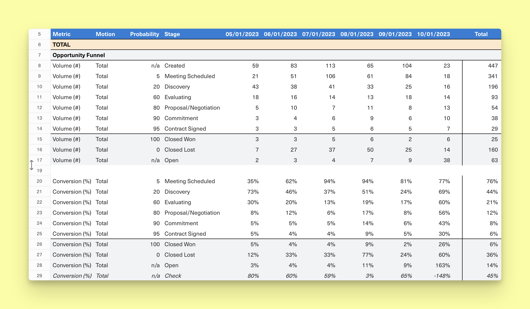
Deal conversion
We also track conversion rates throughout the funnel to see how deals are progressing.
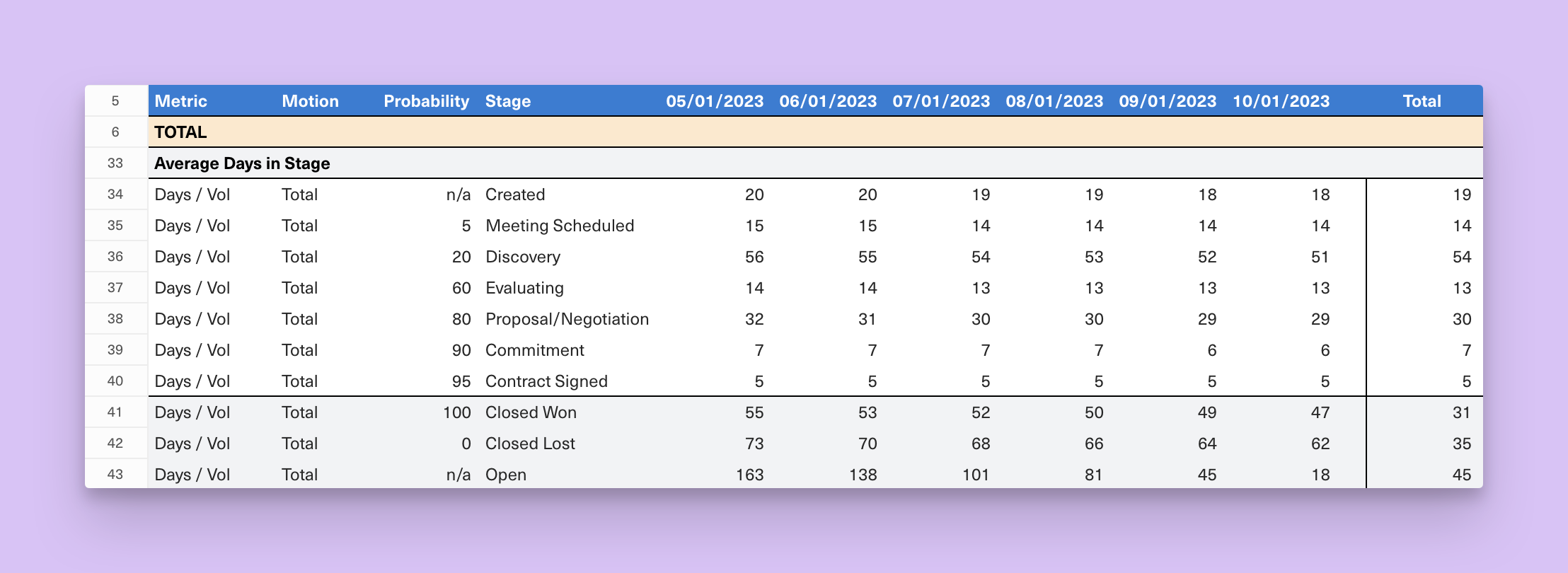
Deal velocity
Lastly, we track how quickly we’re moving deals through various stages. This serves two purposes:
- helps us understand time to close for tops-down forecasting
- enforce hygiene by making sure we’re closing out stale opps that have been open for too long
Analyzing performance across the entire sales funnel helps us ensure the actions we’re taking today will help us build the pipeline to support forecasts in the future. And since we’re looking at it on a regular basis, we can address performance or hygiene issues before they become problematic.
Feel the (cash) burn
Preserving runway is top of mind for every startup, but teams often overcomplicate cash burn reporting in the early days. Success should not be defined by the number of things you track but rather by how closely you monitor what actually matters.
Stay disciplined in hiring, build a simple schedule for large cash outflows (large vendor or lease payments, Sales commissions, etc.) and have a “pro forma” view for one-off expenses (purchasing a domain, fundraising expenses, etc.) to give you a sense for true go-forward spend. Here's our own monthly snapshot, for example.
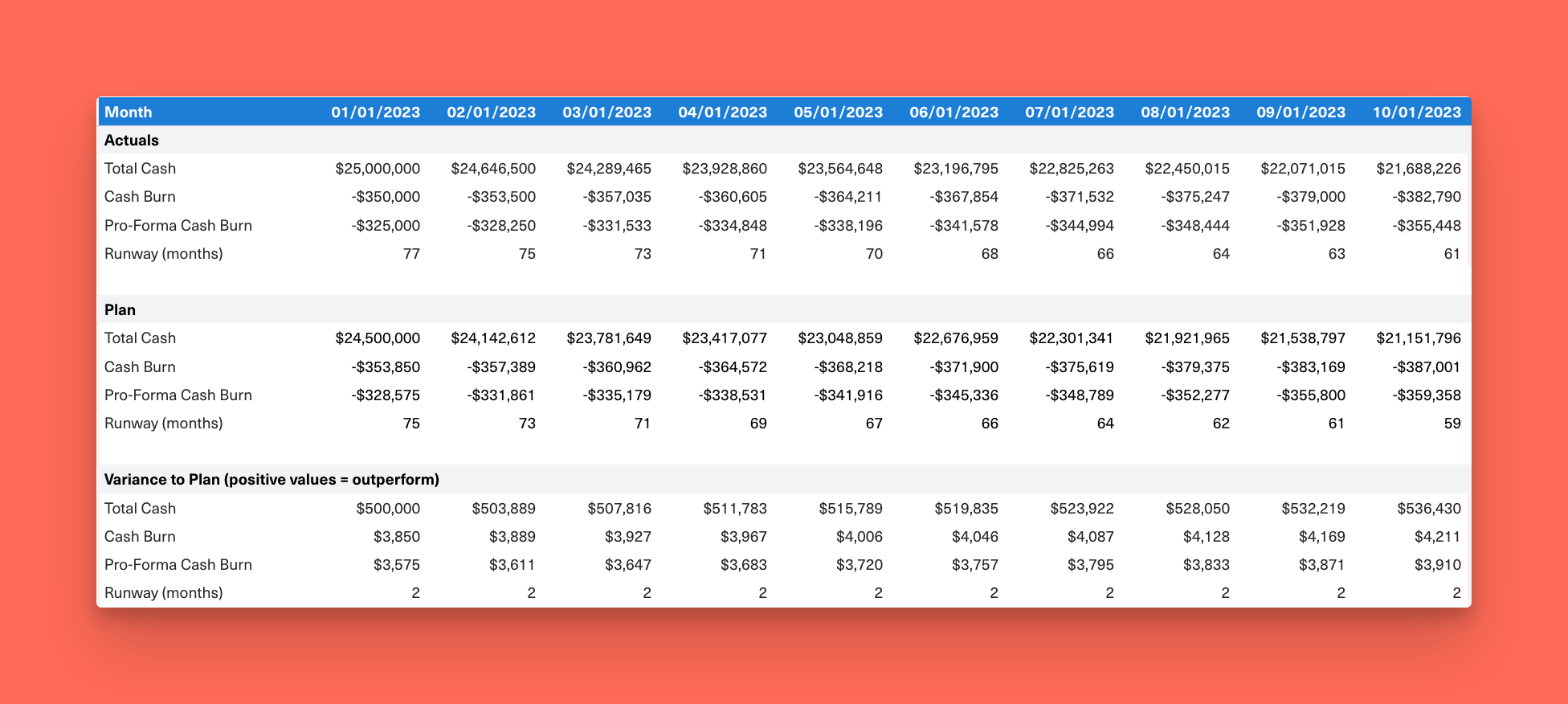
You should be looking at your burn on a weekly basis–at a minimum. So setting this up in a way you can quickly update is key. We’ve connected our bank accounts to a Plaid datasource that automatically pulls our total cash balance, burn and supporting transaction detail every day. We then aggregate it at the weekly and monthly levels to understand intra-month pacing.
We've created an Equals template to help you get started because no one wants to run out of cash. 😅
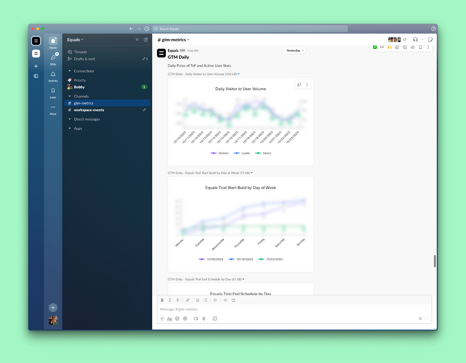
It's all powered by Equals
Naturally, we’ve stood up all of this reporting in Equals. Every table and chart you’ve seen came straight out of an Equals workbook.
How do we track so much, so frequently, with just a single person (me) in finance and analytics? Simple. We’ve automated all of the pulling, calculating, and reporting of these metrics from a wide range of different datasources, including our Postgres database, Stripe, Quickbooks, Google Analytics, Salesforce, Outreach, and more. It’s been one of the most impactful ways I’ve been able to scale myself.
If you’re interested in learning more about how we’ve built this or want to get help standing up reporting for your own startup, reach out or start a free trial today.

By Chris Burgner
Head of Finance & Analytics at Equals
