How we improved charting
Abbey Lauren Minondo | | 3 min read
We recently redesigned charting in Equals. Today, we’re sharing the process behind this build. Here’s how we discovered an opportunity and the decisions we made along the way.
At the beginning of the year, we reflected on conversations we had with users. We noticed that most were busy creating models and crunching numbers, but not too many were visualizing those insights. In fact, some were going as far as creating entire reports in Equals and then copying data into another system just to make a simple graph! Clearly, this called for investigation.
To validate the trend we were observing, our design team conducted dedicated interviews with a random sample from our user base. These interviews confirmed that most users were initially excited about charts, but abandoned them soon after initial interaction.
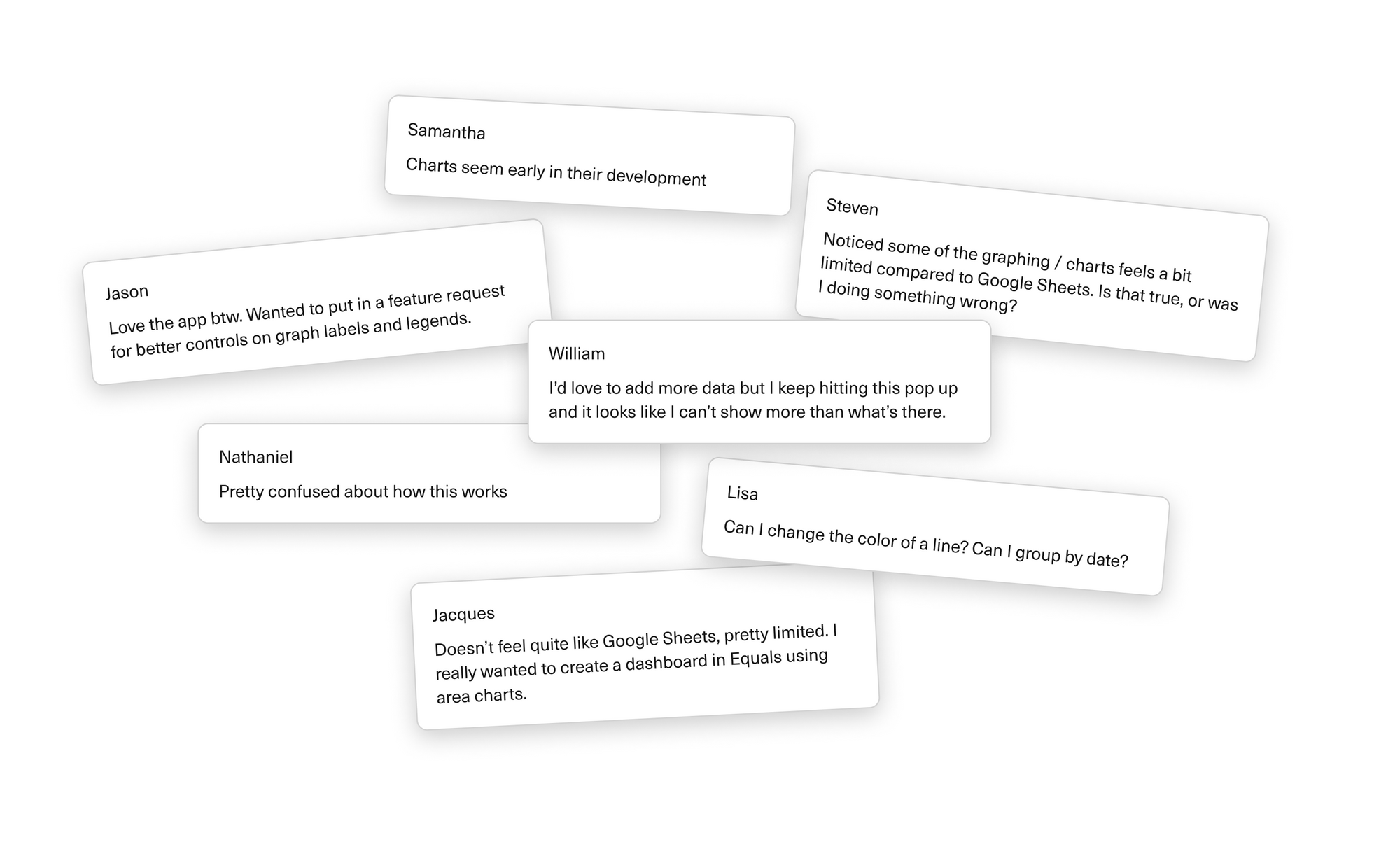
The sentiments expressed were echoed by many others. Our charts needed an upgrade. When organizing what we’d heard, it became clear that charts were confusing to configure, required data manipulation to display things meaningfully, and were limited in terms of customizability. So we rolled up our sleeves and started making changes.
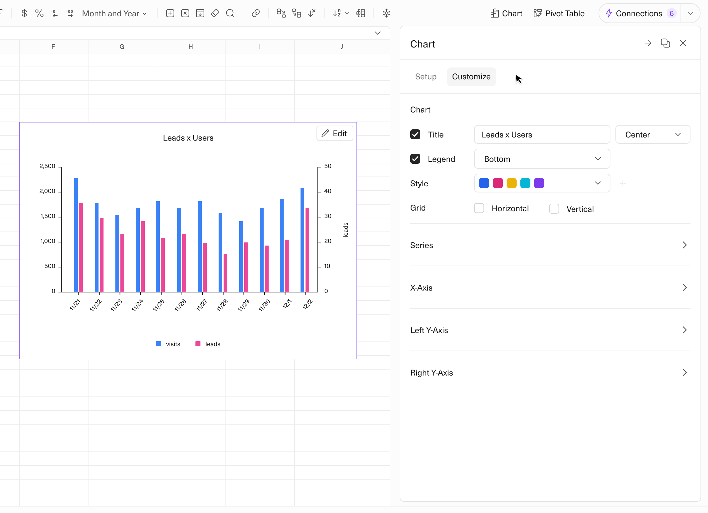
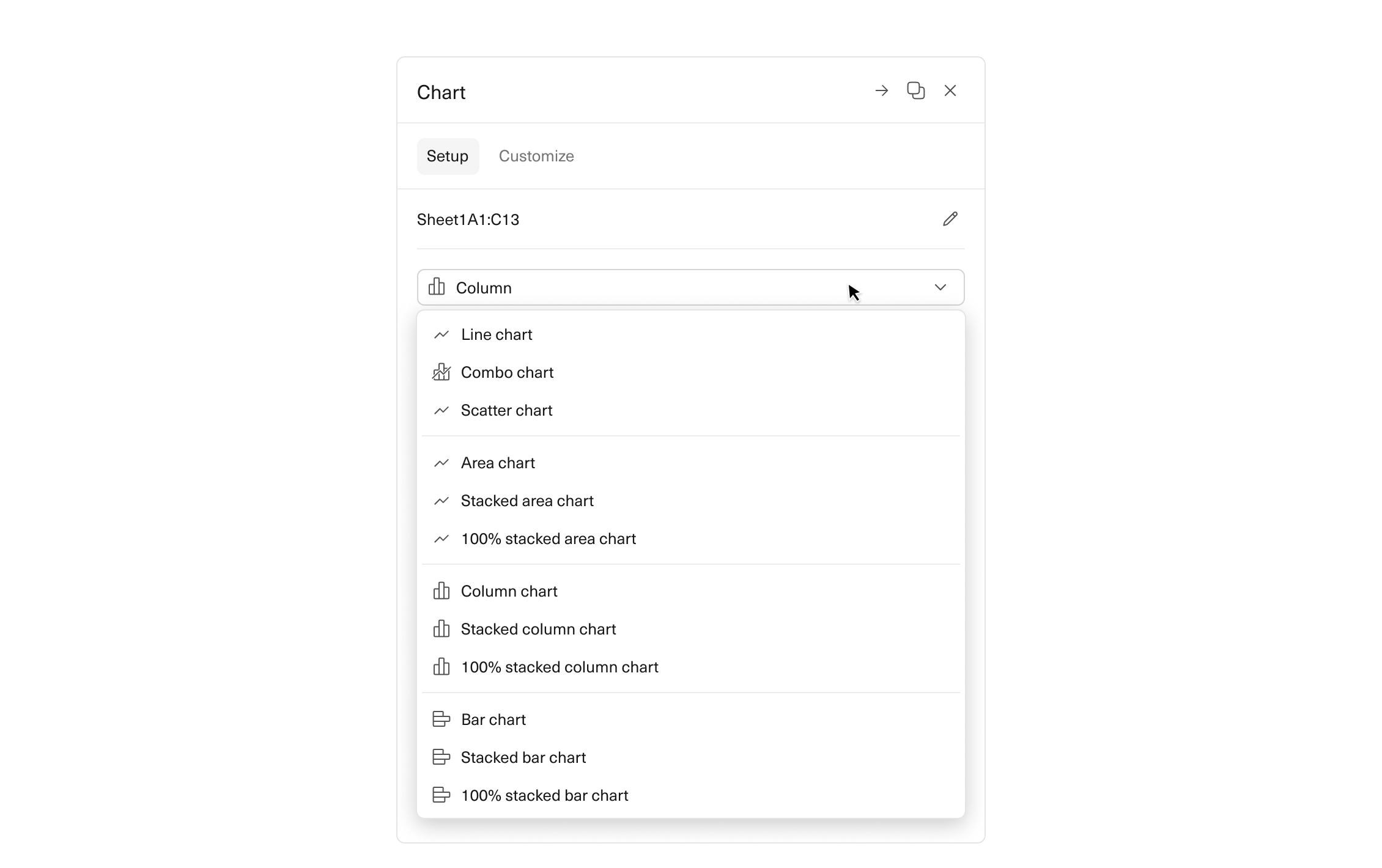
Simplified UI – We consolidated chart editing options into one neat sidebar. From our video calls, we gathered that editing in two places is not intuitive. The majority of users we spoke with were familiar with Google Sheets' charting layout, which is why we made a deliberate decision to follow that model, instead of Excel.
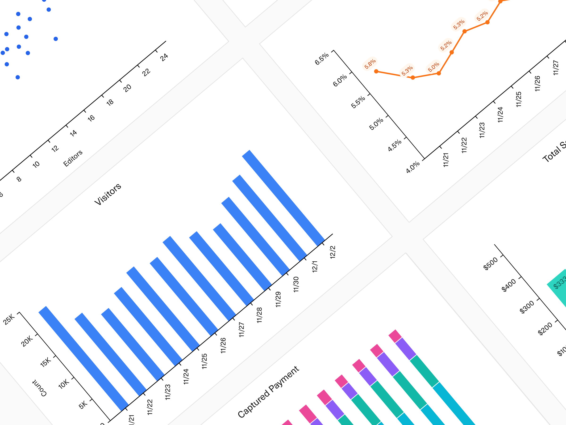
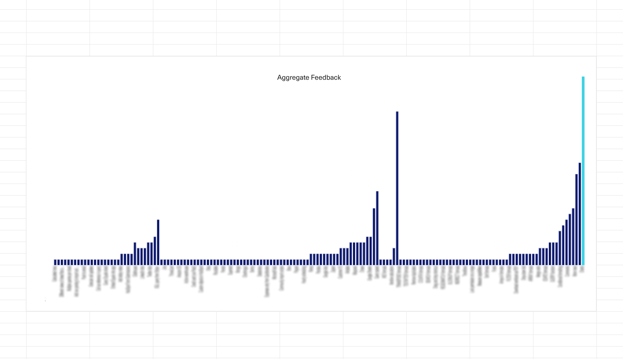
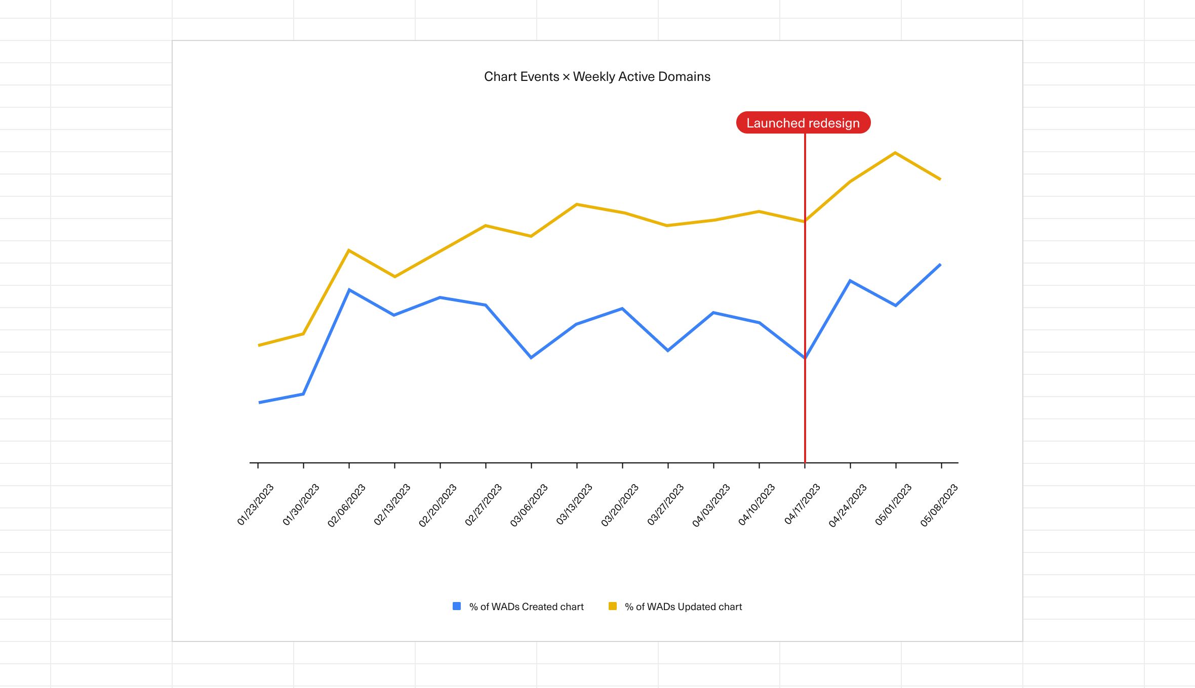
Unlimited data points – We fixed performance issues that allowed us to scrap the data point limit: Equals visualizations can include as much data as desired. Our users love working with large data sets, especially when it comes to plotting multiple series. Or when tables are set to auto-expand.
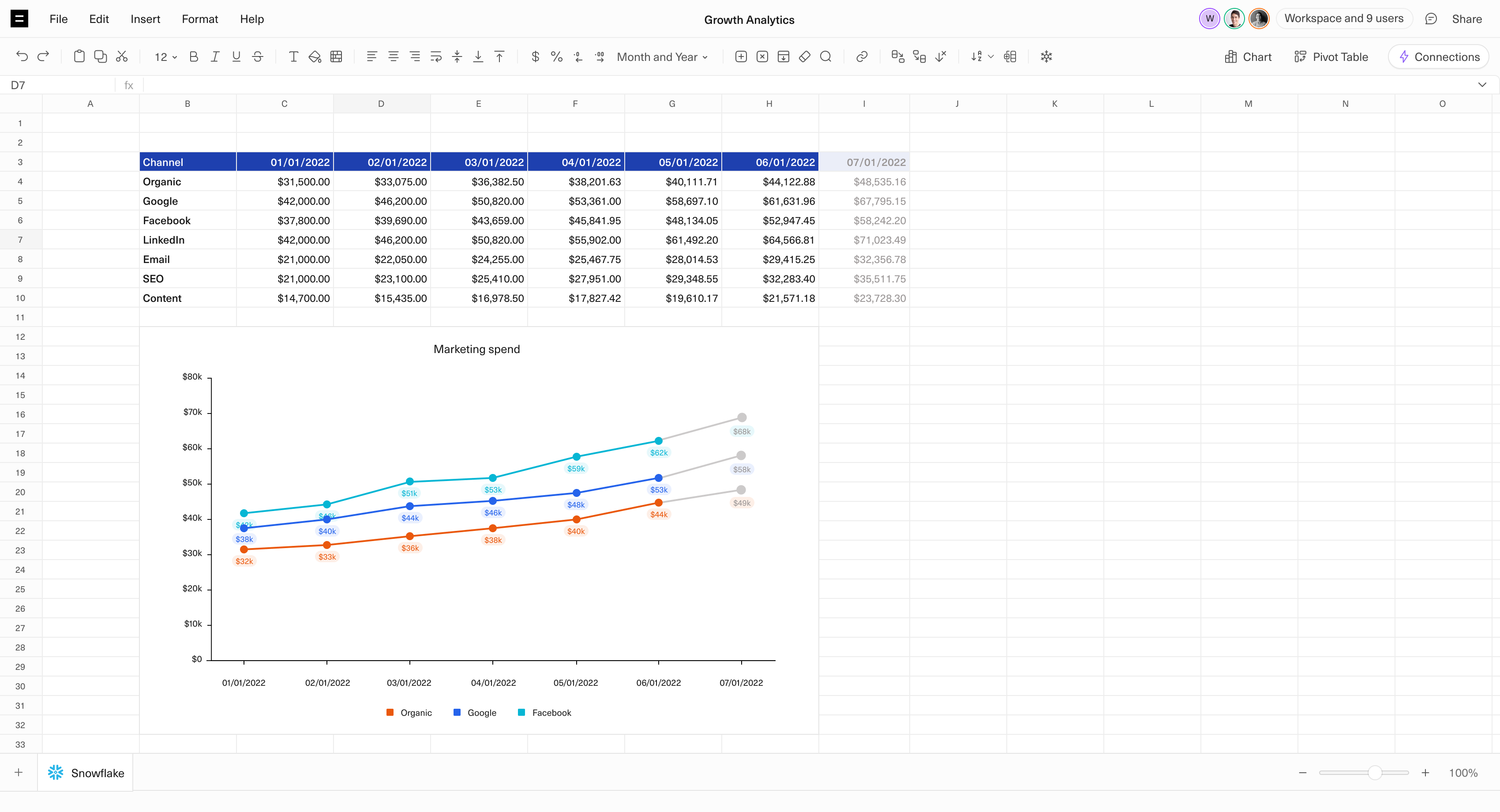
More customization – Charts needed to be flexible enough to visualize any dataset, so we built 12 different chart options, custom colors, and scale adjustment. They also needed to require as little pre-work as possible, which is why we added advanced data aggregation. We spent most of our effort here, so that users can plot their wildest ideas on top of live data and watch charts magically update as new information rolls in.
Although these changes have only recently been released, initial adoption is promising. Our power users are diving in, building and modifying charts like never before.
We want to invite you to explore the power and flexibility of our redesigned charts. Build something beautiful in Equals. And don't forget to let us know what you think.

By Abbey Lauren Minondo
Business Operations at Equals
