Sales Efficiency Modeling at Intercom
Chris Burgner | | 8 min read
Operator’s Dilemma Series
Every company leverages a shortlist of models and frameworks to run their business but the stories behind their development are often the best kept secrets in the industry.
We're excited to continue our Operator’s Dilemma series where we go behind the scenes to share insights from the best builders and operators in tech.
Be sure to check out our prior posts from leaders at Figma, Pinterest and Snowflake.
Intercom’s Sales Efficiency Model
Intercom is one of the earliest examples of viral, product led growth in SaaS. From its founding in 2011, the product quickly resonated with the growing population of early stage, digitally native businesses.
As these early adopters installed Intercom’s messenger on their websites, they created new touch points with prospective users. Once these users engaged with the product, they too became hooked with the simple and delightful approach to communication, driving more organic signups and paying customers. This “Self Serve” flywheel resulted in massive growth early on.
While growth in this Self Serve motion continued to compound, the executive team knew a different approach would be needed to land larger, more complex customers. So, fresh off the heels of their $50M Series C funding, the company decided to double down on building a scaled Sales motion.
It was around this time Kevin Kooi joined to lead FP&A and would build the critical reporting needed to help measure progress in the new motion, enabling the team to tweak the levers of growth and preserve runway in the process.
Today, we’re excited to share the Sales Efficiency model he built, which is still in use to this day!

Model Context Setting
Metrics Overview
Selection Criteria
Kevin’s team knew selecting the right metrics was critical to have a holistic read on performance.
As it goes in SaaS, investing in Sales typically requires a big cash outlay in the beginning that doesn’t show more meaningful returns on investment until the team gets to scale. Kevin needed to keep close tabs on these initial investments and develop some sense of when the returns would start to roll in.

One of the ways Kevin was able to create these internal checkpoints was through the use of benchmarks. By looking at efficiency metrics of other SaaS businesses, Intercom could set aspirational targets for where it eventually wanted to be. Kevin could then develop scenario models that charted the course to hitting those targets based on the scale and pacing of both the investments and returns in Sales.
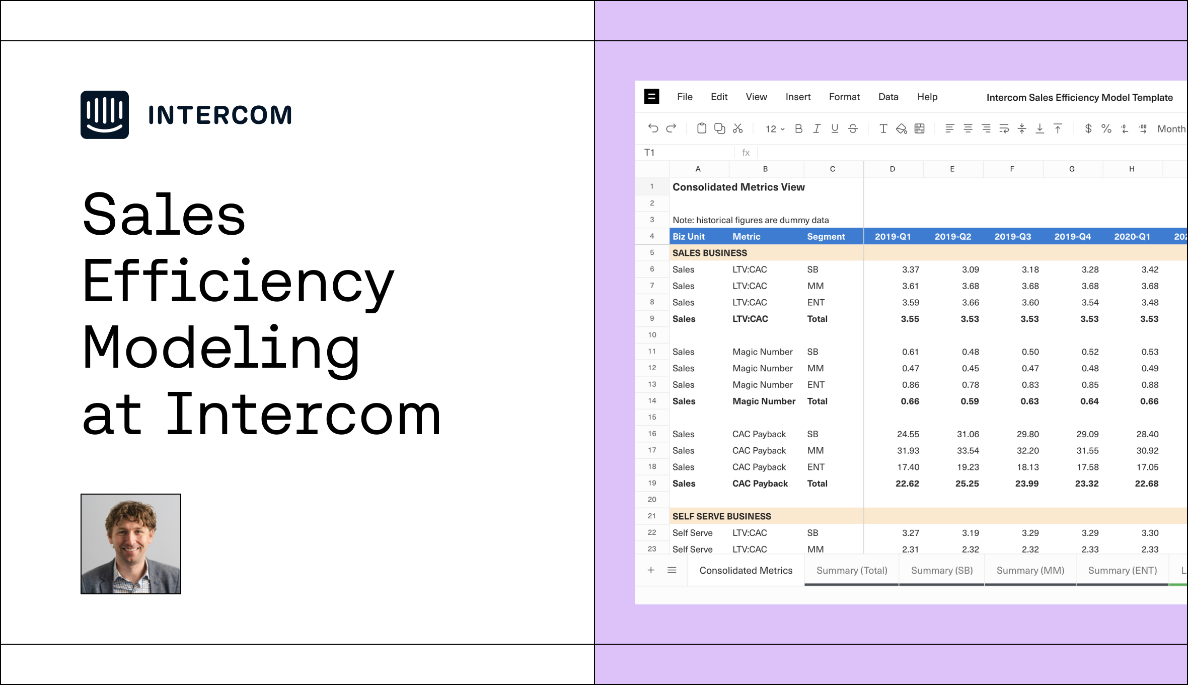
With this in mind, the team eventually landed on three metrics that could be easily benchmarked: Magic Number, CAC Payback and LTV:CAC.
Metrics Defined
See below for the methodology to calculate each metric.

Together, these metrics give a view into efficiency in the short (Magic Number), medium (CAC Payback) and long term (LTV:CAC) and can easily be benchmarked against peers given their prevalence in SaaS reporting.
Splitting by Business Unit & Segment
In the first iterations of Sales Efficiency modeling, Kevin’s team focused exclusively on performance at the aggregate level. He cautioned that trying to go too deep in cutting and cross cutting the data can lead to confusion and false precision early on.
However, as the number of customers acquired through the Sales motion grew, they started to split performance at the Business Unit level: Sales and Self Serve. As expected, the efficiency of Self Serve outperformed Sales initially but over the next several quarters the gap would narrow as incremental lifts in Sales ARR outpaced expenses.
As the signs of success in the Sales motion became evident, the company set its sights on acquiring progressively larger and larger customers. This created a need to report results at the customer segment level based on employee count: Small Business, Mid Market and Enterprise. The thresholds for these breakouts would shift over time but always matched to the org structure of the Sales and Marketing teams.
These crosscuts gave the team a way to think about optimizing the balance of investments between acquisition motions and measuring the success of strategic initiatives like moving the company’s customer base further upmarket.
Sales Efficiency Model Overview
Now that we have an understanding of the metrics and crosscuts, let’s dive into the model.
Model Overview
The goal of the Sales Efficiency model was to give a holistic view into how investments in the company’s GTM motion generated future returns. By starting with three metrics that tracked performance by different time horizons, they were able to quantify efficiency across the short, medium and long term.
Additionally, breaking these metrics down by Business Unit and Segment allowed them to understand where areas of strength existed to double down on, helping reinforce decisions around strategic investments in growth.
Summary Tabs
The methodology behind the efficiency metrics lives in the model’s Summary tabs, which are organized by Segment. Within each Summary tab, the metrics are calculated on a quarterly basis at the Business Unit level.
Let’s pause here to unpack how each of the metrics are calculated.
LTV:CAC Methodology
For a primer on LTV:CAC check out our Understanding LTV:CAC blog post.
To model the estimated aggregate lifetime value of a customer, Intercom solved for LTV by taking the expected customer Lifetime (in years) multiplied by an assumed annual growth rate over each successive year. The assumption for Lifetime was powered by historical customer retention curves, while Net Revenue Retention (“NRR”) was used as the proxy for annual growth rate.
From there, the team adjusted LTV for Servicing and Upsell/Renewal costs. Servicing costs included expenses related to hosting and customer support coming from the COGS line item of the Income Statement. Upsell/Renewal costs were recurring expenses associated with Account Managers, CSMs and lifecycle Marketing campaigns incurred over the life of the customer.
The end result provided the final LTV for each cohort in the numerator, while the remaining Sales & Marketing expenses informed the “Acquisition Costs” in the denominator.
Commonly held wisdom would say an LTV:CAC of 3.0x - 4.0x is considered healthy but special attention should always be paid to validating the underlying assumptions as they can significantly impact the result.
Note: all historicals and projections are dummy data.

Magic Number Methodology
While the process for calculating LTV:CAC took several steps, Magic Number was much simpler and did not require assumptions on future performance. The team simply took Gross New ARR in the current quarter divided by total Sales and Marketing spend from the prior quarter.
The simplicity and transparency in calculating Magic Number made it a helpful metric for benchmarking purposes as it could easily be evaluated across any publicly traded company.
Intercom targeted a range of 0.75x - 1.00x for this metric at maturity but understood that more nascent segments would start lower and build up to the desired range over time. Taking this nuance into consideration is why looking at the second and third level was so important.
Note: all historicals and projections are dummy data.

CAC Payback
Finally, CAC Payback gave the breakeven point where the Gross Profit generated from the customer base equaled the cost to acquire and maintain them. The use of Gross Profit was important as you couldn’t be “made whole” on an investment until servicing costs were covered, in addition to Sales & Marketing expenses.
The team calculated CAC Payback by taking the Sales and Marketing spend from the prior quarter divided by the annualized Gross Profit from the current period.
The quicker you can hit that breakeven point, the better. Typically, you’d like to see CAC Payback be somewhere in the neighborhood of 12 to 18 months depending on the maturity of the business line. As an example, when Intercom started to invest in moving up the Enterprise Sales stack its CAC Payback was much higher in this segment. This tradeoff was worth making as it required investing ahead of growth in building a Sales and Marketing team that could attract these customers several quarters before those sales landed.
Note: all historicals and projections are dummy data.

Lifetime & Retention Methodology
Intercom kept close tabs on logo retention and NRR trends as they provided the inputs for calculating LTV. The team pulled results for these metrics on a quarterly basis and revisited assumptions in the event performance trends changed.
Lifetime Methodology
The Calculation Details section of the Lifetime tabs broke out the logo retention, or Survival Rate, of each customer cohort (y-axis) as they aged in months (x-axis).
Most startups can appreciate that the tricky part of this exercise is finding the right balance between gathering a large enough sample size to formulate a baseline and maintaining historical relevance to the business. The more cohorts you include in the baseline, or the further you go back in time, the less likely those cohorts are comparable to the business today as changes in pricing, product offering or a laundry list of other factors can impact retention.
For Intercom, the 24 month mark was the optimal period to assess lifetime and also only considered performance for the last 12 quarterly cohorts. By pulling at month 24, the team avoided some of the noise of performance in Year 1, particularly in the Self Serve business. This Business Unit tended to see high churn rates in the first 3 - 6 months, from customers on month-to-month plans, which pulled the implied Lifetime down. However, customers that remained beyond this time period retained at much higher rates as shown in the graphic below.
Note: all historicals and projections are dummy data.

NRR Methodology
The final step in deriving LTV was modeling how a customer’s spend changed over time which could be accounted for through NRR (for an overview on NRR see our blog post here).
The team elected to look at NRR on an uncohorted basis as they struggled to identify a stable trendline through the cohorted methodology leveraged for Lifetime. This is more common in NRR reporting as a single, large spending, customer makes up a larger representation of the overall pie as compared to logo retention.
These uncohorted values provided a steady blended average of growth across a customer’s entire life and removed the noise of the cohorted approach.
Key Takeaways
Intercom’s Sales Efficiency model armed the team with the tools needed to chart its path towards profitable growth and keep a close eye on strategic investments in the Sales motion. It also gave them a way to benchmark internal performance against other SaaS businesses and create a plan to meet, and exceed, the efficiency of their peers.
See how this was done with this Equals Template and check out our live discussion to learn more. Finally, keep the conversation going by getting in touch with Kevin on LinkedIn at Kevin Kooi and Chris at chris@equals.com or @chris_burgner on Twitter.

By Chris Burgner
Head of Finance & Analytics at Equals
