Because the world needs better dashboards
Bobby Pinero | | 4 min read
Does it really? Hell yes.
The explosion of data tooling over the past decade led to a lot of innovation but also a ton of wasted analysts’ time (and dead dashboards). It's time for a new approach.
Almost every analysis starts and ends in the same place–the spreadsheet. Yet, in between, we’re stuck in a dizzying, round-a-bout workflow of new tools. We’re left bouncing between data warehouses, data pipelines, BI tools, and notebooks.
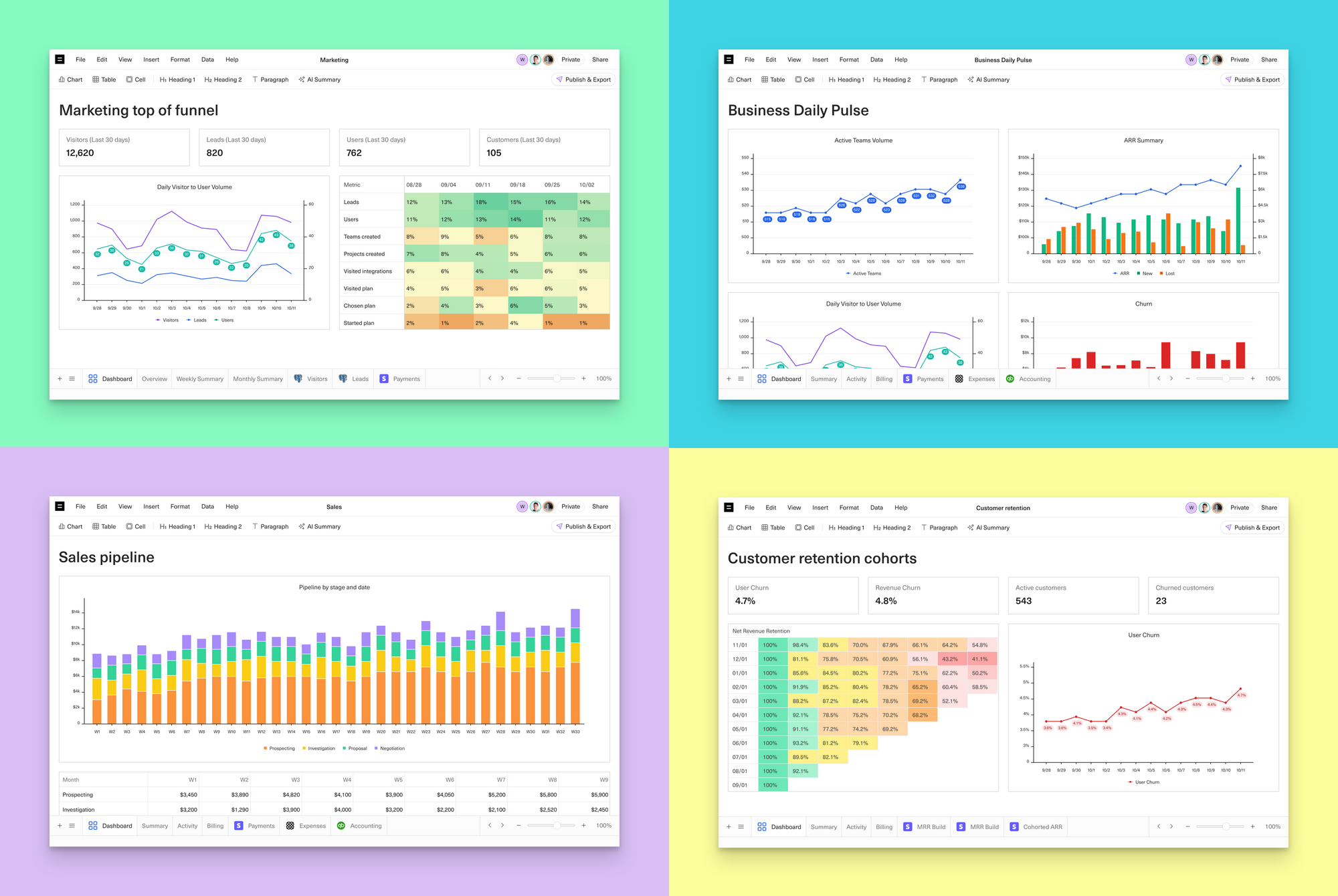
So we built something new. Something no other tool on the market lets us (analysts) do—the ability to instantly turn an analysis into a dashboard, where you already are– your spreadsheet.
How it all started
One of the first times I remember dreaming up Equals was an entire decade ago. It was during the early days of Intercom, where I ran finance and analytics.
I was trying to build ‘The Daily Pulse’ - a report that went out to the entire company—every day.
Believe it or not, this one report changed our trajectory. But it was SO DAMN HARD TO BUILD.
Why? Our data was messy, just like almost every other startup.
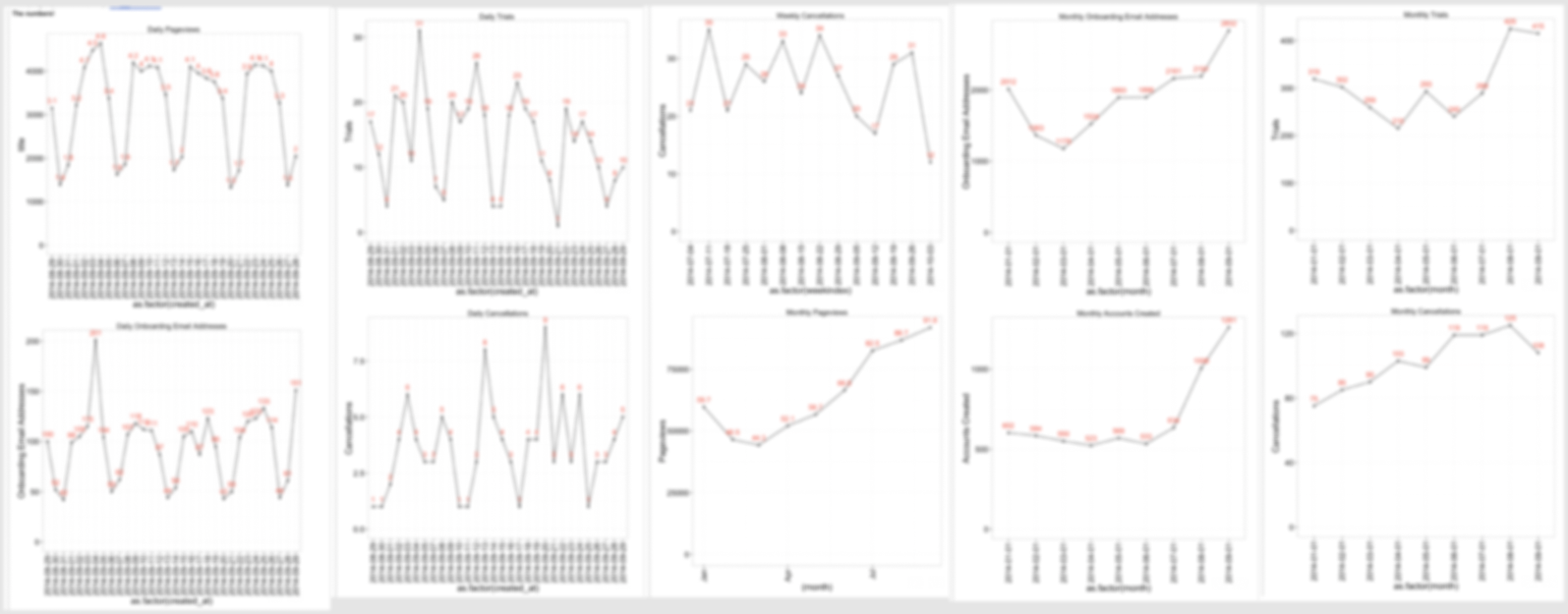
I couldn’t just plug in a BI tool on top of our database and instantly have beautiful charts. I needed to do some manipulation of things. I needed to combine multiple data sources.
And so I ended up having to build a monstrosity of a thing. Rough steps included:
- Buying a Mac Mini that ran perpetually under my desk
- Writing a multi-thousand-line Python script to aggregate, summarize, and make charts
- Spinning up a server
- Putting said Python script on a cron job
It took me weeks. And I had to bother engineers on the team along the way. And any time it broke, I was back in that hellscape.
Ultimately, I knew what I wanted could’ve been done in Excel in an hour. 😅
Because you always end up back in a spreadsheet
This belief is where Equals started.
And it’s deeply resonated with analysts around the world ever since.
And yet analysts today are stuck either doing what I was stuck doing with ‘The Daily Pulse’. Or they prototype a dashboard in Excel / Sheets. Then spend the next two weeks trying to recreate that same dashboard in Looker or Tableau. To then only download everything back into a spreadsheet when they need to answer a question about it.
WHYYYYY?!
Mainly because traditional spreadsheets:
❌ don’t let us automate our work.
❌ don’t connect to our live data
❌ don’t auto-update our tables and charts
❌ don’t make it easy to create beautiful, shareable dashboards
That’s too many “don’t”s.
A million dollar move and a ten cent finish
The state of most analyses looks something like this within most companies.
@bleacherreport Million dollar move 10 cent finish 😭 #nba #basketball #denvernuggets #nikolajokic #jamalmurray #sports #funny
♬ original sound - bleacherreport
A lot of fancy moves. A lot of fancy passes. But ultimately no impact. No result.
Why? Because dashboards live in yet another silo. Nobody logs in. They’re usually slow AF. They suck.
The magic part about ‘The Daily Pulse’ at Intercom was that it also got SENT every day to the entire company. It was ready and waiting in their inbox every day at 5 p.m. No “loading” required. Nobody had to remember to log in to a dashboard – it changed the company.
Starting from first principles
So, when we embarked on building dashboards we started from first principles. We wanted to ensure every analyst could get their work in front of their stakeholders:
✅ how they wanted it
→ include cells, tables, charts, text, and AI-generated summaries
✅ where they wanted it
→ reports in email, Slack, or Slides
✅ when they wanted it
→ scheduled sends every week/day/hour
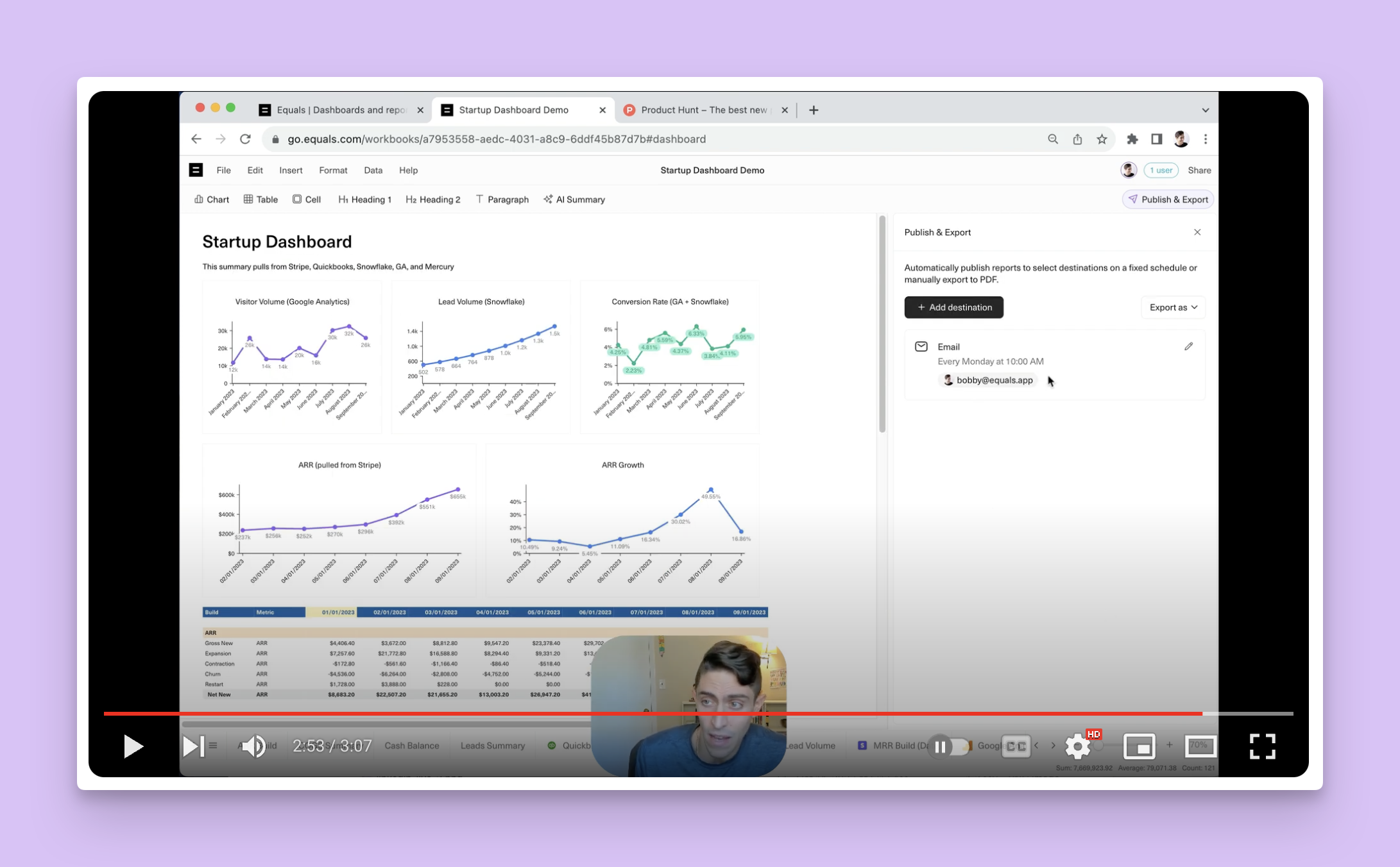
All this without ever having to leave the tool they were already in–their trusted spreadsheet. Here's a live demo I recorded showing all this in action.
Coming full-circle
Today, our own head of finance Chris Burgner has set up our own “daily pulse” that is sent to every cellmate. In Slack. Every day. It only took him an hour. Thanks, Equals.
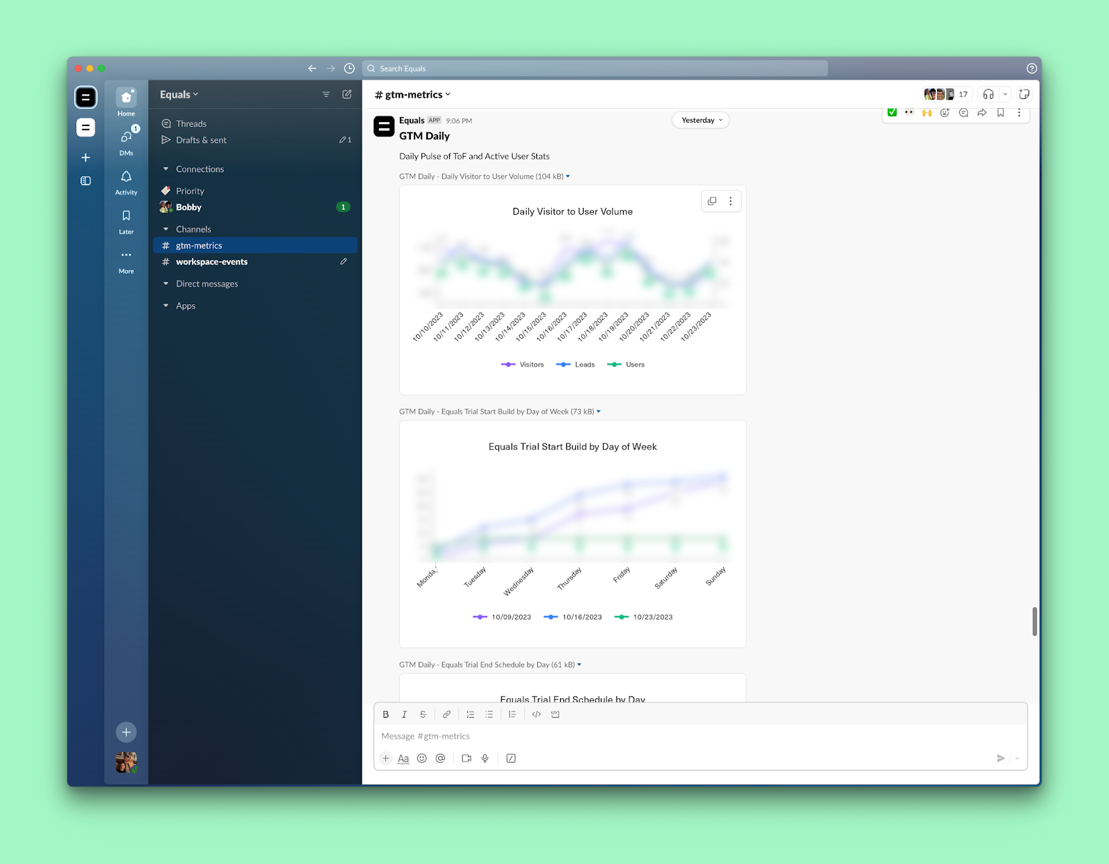
And it’s had the same impact here as it did at Intercom. We’re WAY more on top of what’s happening in our business. Because we see it daily. We respond to it daily. You might say we... always have our finger on the pulse.
Startups are all about speed. We live and breathe by how quickly we move. And here’s what I can guarantee you. Dashboards in Equals will help you get insights faster. But more importantly, take action faster.
Try them free and register for our live webinar for a deep dive with me and my co-founder, Ben.

By Bobby Pinero
CEO and Co-Founder of Equals.
